Services

Design

A good design should aspire to be more than just eye appealing. Digital experiences should be useful, easy to use, and delightful to interact with. Backing up the design with solid research about the business and user base can enhance the experience people have while interacting with a product or service.

Usability Testing

Uncovering how people use the service and discovering opportunities to improve it.

Learning from users' feedback 

Usability testing is all about getting real-life users to interact with a website, an app or any other product to see how easy to use a service or product is by observing their behaviour and reactions to it, where they encounter problems and hurdles to overcome or experience confusion as they attempt to complete tasks on it. Those tasks represent actions that a real user would typically carry out with the finished service or product. They must be pivotal to the service and represent business value.

Usability testing is an integral part of an iterative design process. All findings are analysed and converted into redesign recommendations for the next iteration. The main goal is to make sure an effective, efficient and enjoyable experience is build for the users. 

If we think about an e-commerce website, for example, we might want to know if the users can filter to find a product they are looking for, if they can easily select and add products to the shopping cart and complete the checkout process or if they perceive payment methods as safe and secure.

A designer or project manager in-dept knowledge of, and familiarity with, their product might blind them from seeing its design and usability issues. Whether during the development of a new product or the redesign of an existing one, the design process can benefit from having a new set of eyes testing the user experience.

Choosing your sample

It’s important to establish clear criteria for recruiting participants, so that they closely resemble the actual user base of the product or service being studied. In order to have a representative sample, 5 participants is the ideal minimum to recruit. However, the broader the testing, the more insights and usability problems might be identified. 

The test setup 

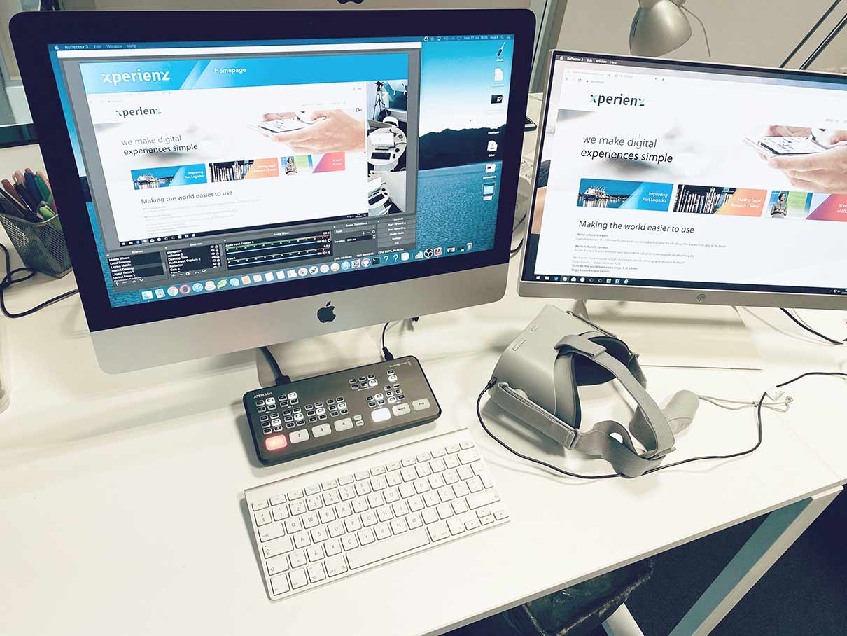
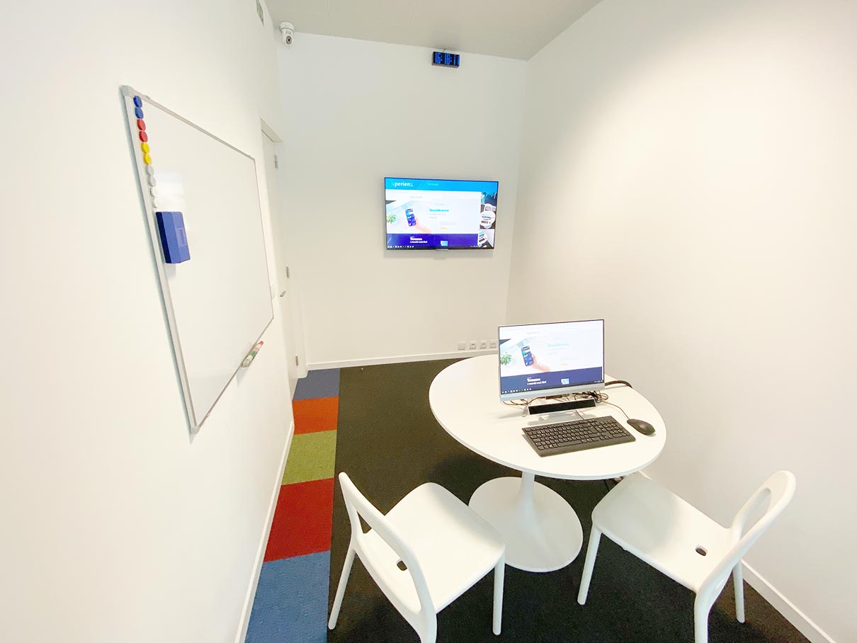
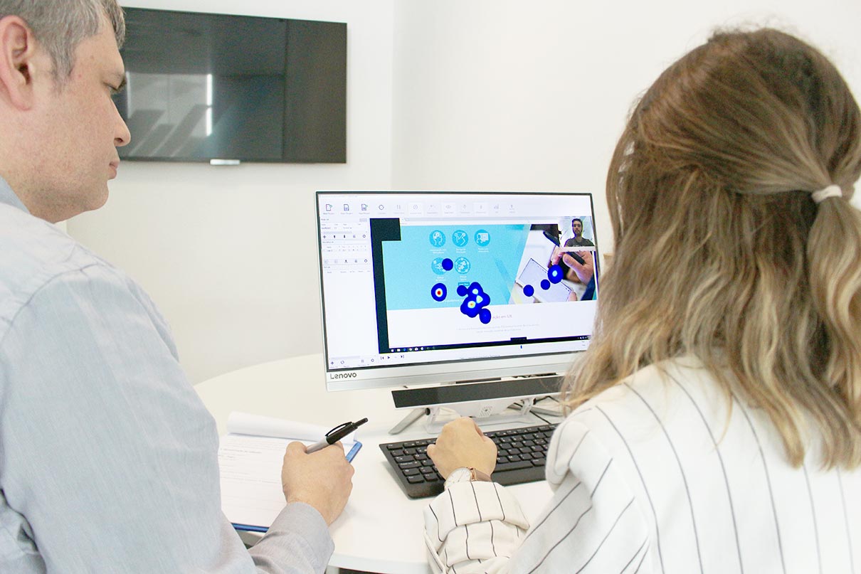
Participants perform the tasks in an isolated room, with no distractions so that the use of the service or product can be as close as possible to a real-life situation. They use a special desktop computer which is running screen-recording software and has a webcam to capture their facial expressions. Other cameras strategically located in the room might also be used to capture body language. 

In the room there’s also a note taker to ensure the facilitator can be 100% focused on guiding the participant through the process and no insight is forgotten.

Running a usability test

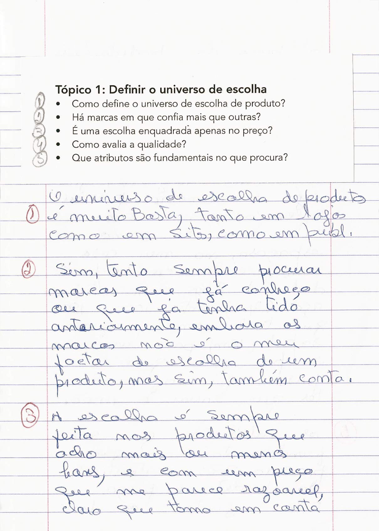
In a usability-testing session, a facilitator asks the participants to perform a series of tasks. Those tasks are actions that the participant might typically carry out in real life as they interact with the product. As they perform these tasks, the facilitator observes the participant’s behaviour, including their reactions, body language and facial expressions, and listens for feedback. The participant is asked to think out loud, narrating their actions and thoughts as they perform the tasks. This allows the facilitator to better understand their behaviours, goals, thoughts and motivations. 

Benefits of evaluating ease of use

  • Prototype validation to ensure a high ROI

    Validate a prototype before spending a lot of money building out a complete service 

  • Reducing the risk of failure 

    Confirm if the product meets expectations thus minimising the risk of product failure

  • Spot errors and issues 

    Identify minor errors such as broken links, errors or grammatical issues

  • Delivering a great user experience

    Create a user-friendly product and provide a great user experience

  • Simplifying processes

    Make sure complex processes are straightforward and intuitive

  • Learn about the target users’ behaviour and preferences
  • Identify problems in the design of the product or service
  • Uncover opportunities to improve

Planning a new research project?

Xperienz is the only UX consultancy in Portugal with their own research facilities, packed with everything to capture your users’ insights. We can test websites, desktop and mobile apps, consumer electronics or any electronic device.

Tell me more
4 years ago

Ethnography Research

Going out in the field and observing users in their natural environment.

Observing users in their own environment

Most of the times people use products or services in ways they aren’t even aware of. Ethnography research focuses exactly on identifying and understanding how users interact with a product or a service in their normal work, home or leisure environment. It looks for challenges and barriers they encounter and how this affects different users.

Ethnography supports the designer’s deeper understanding of the design problem and therefore the design of a better solution. 

Carrying out this type of research makes more sense at the beginning of a project in order to support future design decisions and it can vary in terms of how the researcher interacts or not with the users:

Shadowing · Seeing what users see

These studies are based on passive observation, as if the researcher is “a fly on the wall”, and acts like a user or users’ shadow while they go about their service-related tasks. They are not supposed to interfere with the user as that might change the way they behave in a given circumstance. However the researcher can ask questions for clarification and prompt the participant to give a running commentary on their actions and choices. This allows us to understand existing behaviours so that the designer can adapt the design to those behaviours.

It can take place over any period of time, from a short period to several days or weeks, depending on what the observer wishes to learn.

Contextual interviews · Seeing what users see (and asking them)

The researcher interacts with users while observing them as they work in their own environments, and asks questions to gain more insight about the context of use. 

This method is generally more useful at the beginning of the design process to obtain information about the user’s work practices, their social, technical and physical environment and the tools they use. 

It can help to define requirements, improve a process, learn what is important to users, and ultimately optimise the overall design of a service.

Want to understand how users interact with your product?

Xperienz will run ethnography research studies to find out how people use your product or service in their own environment, identify challenges and needs to support the (re)design of a better user experience. We can conduct research anywhere in Portugal or in the world.

Tell me more
4 years ago

Surveys

Collecting data about opinions and attitudes from a representative sample of the audience.

Making the right questions to collect useful data 

A survey is a quantitative research method that consists of a set of questions used to collect information from a representative sample of the target audience. It can be used to assess their preferences, attitudes, characteristics and opinions on a specific topic.  

Surveys can be conducted at any stage of the development process. They can be a really useful tool to provide input for the design process as they help to better define and understand the customers or user base of the product or service. They can also help mitigating the risk of designing a poor solution for users. 

Creating an effective survey 

To start building a survey there must be a clear understanding of the needs and information required to meet the project objectives. Then, based on the information that needs to be collected, a set of research questions is defined. Relevant questions and a good survey design are crucial to generate quality data and make sure participants don’t drop out.

How to write good questions?
  • Questions should be relevant to survey’s goal. 
  • Questions should be concrete, unambiguous and clear, as there’s no opportunity for the participant to clarify them.  
  • The language used has to be easily understandable by everyone, so words that are not commonly known should be avoided. 
  • If a technical term really needs to be mentioned then it should be clarified.
  • Biases and too personal questions should be completely avoided. 
  • Sentences shouldn’t be too long. 
  • Each question should convey a single idea because if it conveys two ideas it’s possible that the person as a different opinion about each one. For example, instead of asking “Do you like pineapple and strawberries? Yes/No” it should be “Do you like pineapple? Yes/No. And strawberries? Yes/No”. 
  • The survey should begin with an easy question, leaving the harder ones to the end as they are more likely to demotivate participants and eventually make them abandon it. 
  • The survey shouldn’t mix two different topics.

The most effective and engaging surveys are kept short, focused on one topic, and contain a mix of closed and open-ended questions. While close-ended questions (rating scales, ranking, multiple choice, etc.) are good to gather proportions of feedback and priority, open-ended questions (open text fields) can provide more context into what is driving the feedback. However, open-ended questions should be restricted to the minimum and used only for comments as they are harder to evaluate quantitatively. 

Defining the right sample

Surveys are a cost- and time-effective way to understand a topic, if only the appropriate people fill it out. For example, if we want to know more about the use of a certain product, we will want real users of that product answering the questions. To make sure the survey doesn’t hit the wrong audience, we can set some questions that act as a screener. This will ensure we get the right data from the right people.

Besides choosing the right sample, it’s also important to define the sample size. In behavioural surveys the ideal is between 50 to 150 participants and to obtain statistical relevance it should be answered by more than 80 people. 

Making sure the survey hits the spot 

Before distributing the survey is a good idea to run a pilot test in order to validate the questions’ structure and detect possible errors. It should be carried out in the same context as the real test and ideally by 2 or 3 people who correspond to the profile being recruited. If a lot of mistakes are identified during the pilot, then they should be corrected and a new pilot run afterwards. 

Sending out the survey to the audience

The survey distribution can be done in-person or electronically through a survey tool, email or phone. The title or subject should be catchy and it helps a lot if it’s possible to offer some kind of compensation for taking the survey (like a gift card or discount code). It’s also important to include a small description of the main topic and the approximate time needed to complete it. 

Want to collect quantitative data from your user base?

Xperienz will understand the project needs and goals to define the appropriate questions and the right sample, run a pilot test to validate the survey and send it out through the best channel. In the end, we’ll analyse all the data to inform future project decisions.

Tell me more
4 years ago

Service Design

Making services work better for organisations and their clients.

Designing for the complete experience

Users don’t interact with brands in a single touchpoint. A complete end-to-end experience is made of complex chains of interactions. When you book a flight for your next vacation, you use the airline website to buy the ticket,  you open their app to check-in and access the boarding pass, you might contact the call center with a question, upon arriving at the airport you head to their check-in desk, and this is all even before you set foot on the actual plane. All these touchpoints might be quite straightforward or not so much. 

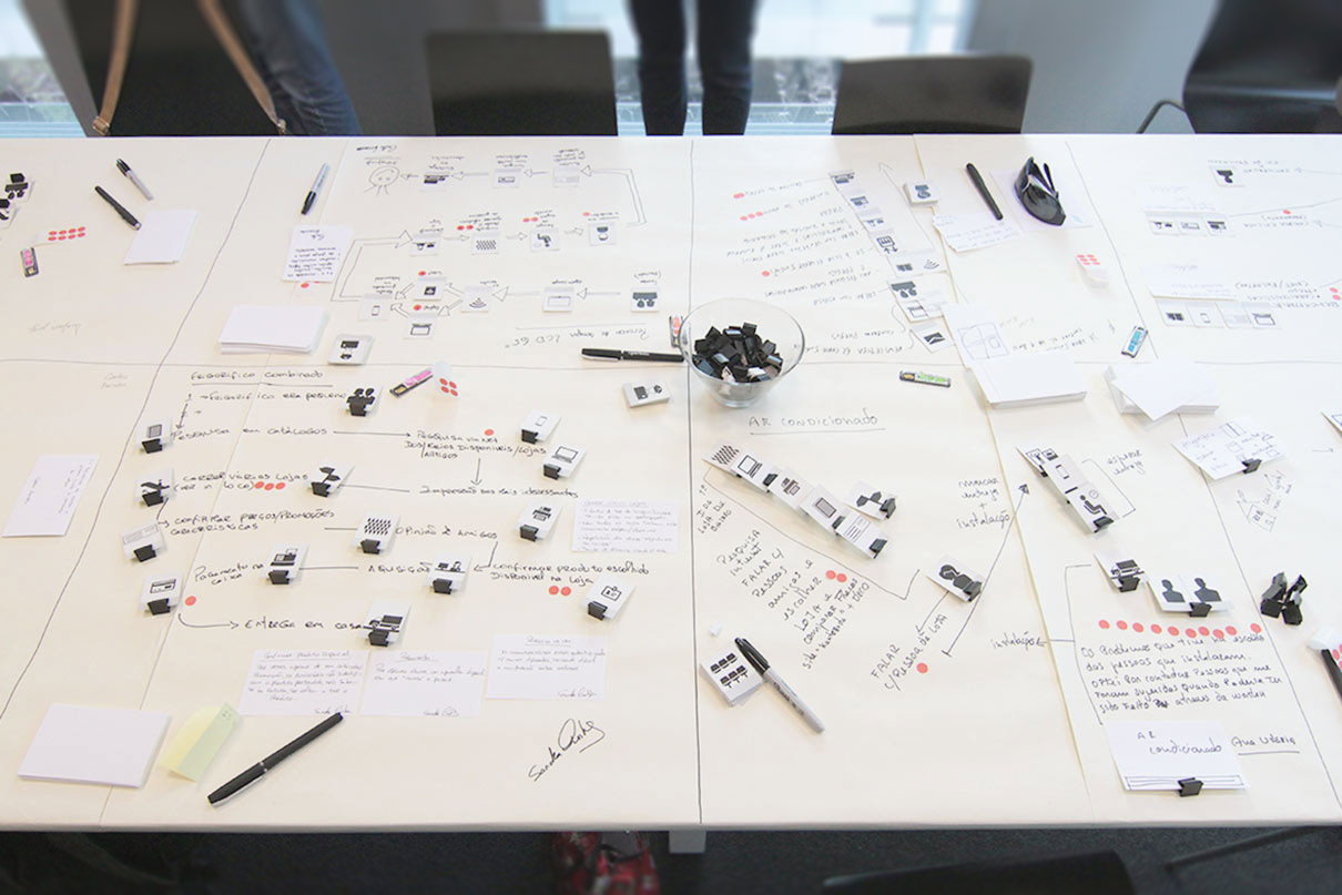
Service design is the process of making services work better for organisations and their clients, through research, developing ideas and testing experiences. To do so, besides taking a user-centred approach, it also comprises all the backstage functions that enable the delivery of a service, from IT to operations.

Service design helps bridge organisational gaps and remove pain points in the customer journey, which requires analysing the workflows and procedures performed throughout a service. It also takes into account the people involved in the creation or use of the service, and props like physical spaces and digital environments.

The Process

  • 1 · Discovering 

    It all begins by talking to the so called stakeholders, which means everyone involved or affected by the service - employees, customers, government officials. The goal is to deeply understand their ideas and what an ideal experience would look like. 

  • 2 · Analising

    Compiling this research provides a complete birds-eye view of the current service and what’s needed to satisfy the needs and motivations of each group. It also allows to identify inconsistencies, gaps and major weaknesses. 

  • 3 · Redesigning the service

    Based on these findings, service designers then work with stakeholders to create a variety of fresh ideas and prototype a solution they believe will improve the service.  

  • 4 · Validating and refining the service

    Next they test the most appealing ideas with real users using prototypes to confirm that the solution designed is the right one. 

Impact and outcomes

  • Increased sales

    The positive interaction with your service will lead to customer satisfaction and generate more profit for your business.

  • Increased loyalty

    Fill in the gaps between what you can offer and what your users need and want, and build a long lasting customer relationship.

  • Improved efficiency

    By identifying problem areas and bottlenecks, and eliminating inefficient processes.

  • Reduced redundancies

    Pinpoint areas that might be overlapping and eliminate inconsistencies and ambiguities.

  • Cost-effective service

    Making the latest technological advances an ally for service and cost optimisation. 

  • Brand recognition in a competitive market

    A better service experience will set the difference from the competition and lead to a better brand awareness.

Want to improve your service?

Xperienz researches and combines innovative design with the latest technological advances to exponentially improve your service. Your business will be more efficient and cost-effective to run and you’ll deliver a great user experience.

Tell me more
4 years ago

Diary Studies

Getting a contextual understanding of users’ behaviour, activities and experiences over time.

Getting insights about users over an extended period 

This longitudinal research method is used to collect data about user behaviours, activities and experiences over an extended period of time that can range from a few days to a month or longer. The participants are asked to write down specific information about activities being studied in a diary.

To create their diaries, participants are given a probe pack with the tools they need to record pre-determined information over time. It may include a notebook, pens, post-it notes, an instant camera or anything that helps the participant gather and record information. 

This method is especially appropriate for testing more complex products or services that comprise a wide range of functionalities, which would be impossible to cover during a usability test session. 

Diary studies are useful to understand long-term behaviours such as habits, usage scenarios, attitudes and motivations, changes in behaviours and perceptions, and customer journeys. 

Recruiting and motivating participants 

Diary studies require time and dedication from participants. One of the major challenges is achieving a high level of participant commitment to obtain sufficient and reliable diary entries. That’s why it’s important that the researcher checks in with participants and gives them periodic reminders. To ensure the right level of involvement, they should receive an incentive that will keep them engaged. So they are likely to require remuneration that is more significant than that of a 60-minute usability test session. 

The instructions given to participants for the diary study are crucial for ensuring its success. They should know exactly how often they’re expected to keep a diary, how long should the diary be, and whether images, screenshots or survey responses are expected. 

Pen and paper or electronic diaries?

Providing a notebook and a pen or pencil is the more straight-forward and budget-friendly option. However, not all participants might have a legible handwriting. 

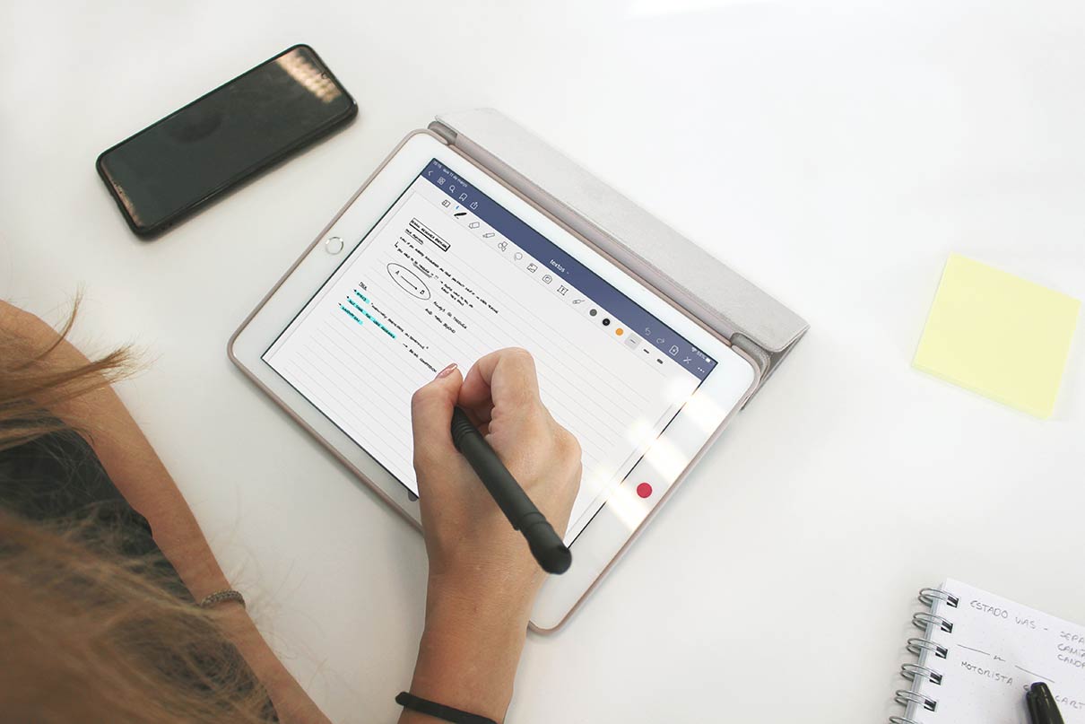
On the other hand smartphones have become so prolific that using an app as a diary might be quite comfortable for many participants. It simplifies data analysis and entries can be logged by voice, video or photos.

Whatever the method, it should be adjusted to the target users. Elderly people might be more at ease with pen and paper, for example. The important is that participants feel comfortable with the process of keeping the diary. 

Benefits of diary studies 

  • Users’ real actions 

    Users record their actual actions and not just what they remember about them

  • Users’ in their own environment

    Users are in a familiar environment and in the actual relevant usage situation

  • Real-life usage situations

    See exact situations in which participants use the product or service

  • Learn about the non-digital aspects of the user experience
  • Find out about the long-term use of a product or service 
  • Helpful to define UX feature requirements
  • Users are not influenced by the facilitator
  • Clarify complex decisions

Want to understand how your users interact with your product in the long-term?

Xperienz will recruit study participants, create a probe pack, define the better approach (paper or electronic) according to your project goals and budget, and make sure participants stay engaged throughout the study. In the end, we’ll present a detailed report with all the findings.

Tell me more
4 years ago

Collaborative Workshops

Understanding stakeholders and users needs to build the right solution.

Collecting information to build a better product

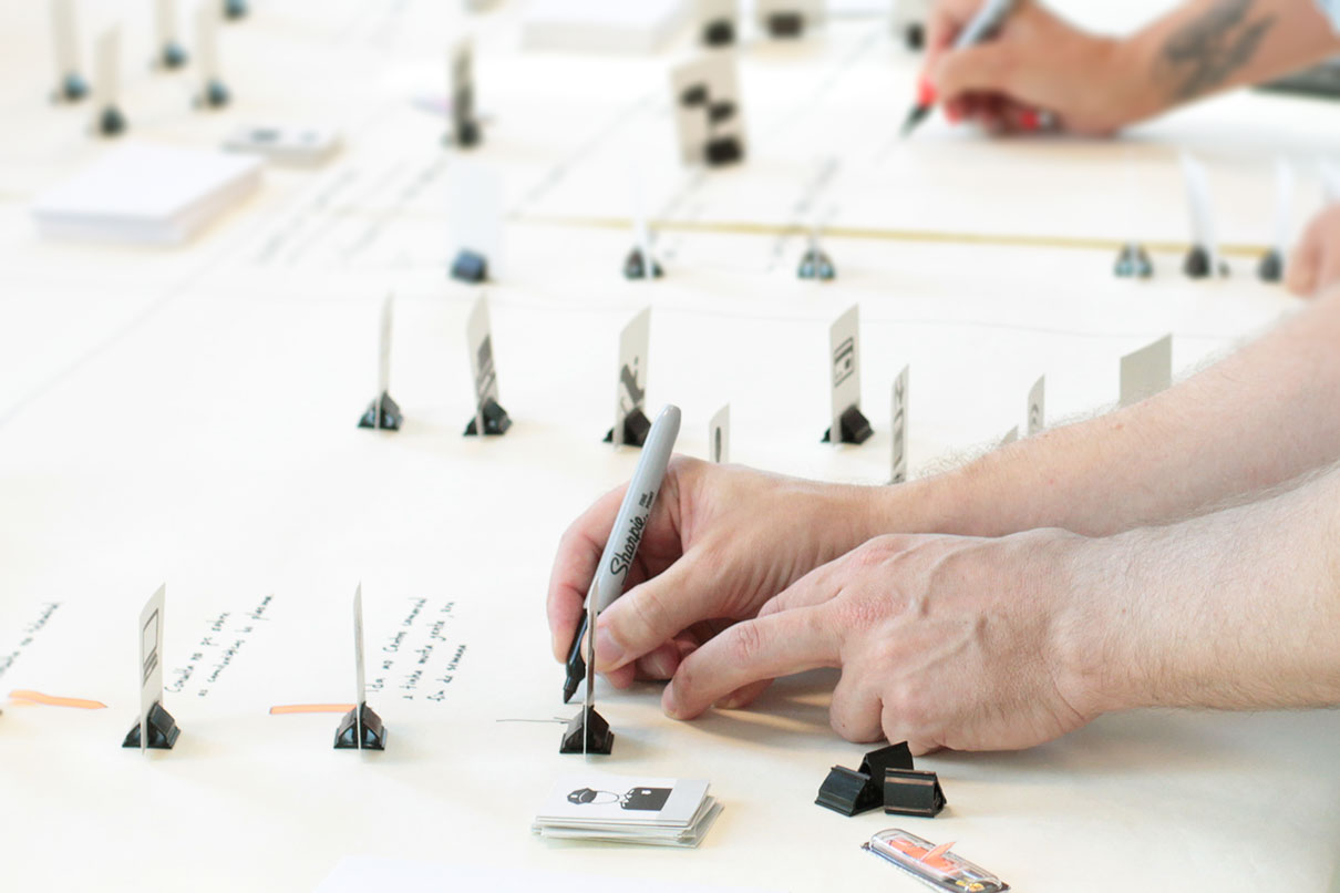
Gathering a lot of valuable insights, in an efficient way and in a short period time is the main goal of collaborative workshops. They are designed to bring together different perspectives, whether from the stakeholders, the users or both. Each workshop must have a defined objective and purpose. Its structure can be quite flexible, and should be tailored to suit the project’s needs and requirements.

Workshops can be used to:
  • Understand requirements by getting to know the business and its objectives.
  • Help stakeholders to think like and empathise with their users.
  • Understand the needs of stakeholders and users better.
  • Collect more in-depth information about the subject.
  • Improve communication between stakeholders.
  • Bring clarity and get teams truly aligned. 
  • Work out ideas and solutions.
  • Analise informations.

During the workshop it’s important that participants feel comfortable with sharing their opinion and discussing different points of view. One of the best ways to get the conversation flowing is to get people out of their chairs. The facilitator hands out post-it notes and pens, and encourages people to scribble down their ideas and stick them on the wall. Other props and materials might also be used. Normally, it also involves a series of games and exercises to extract and prioritise information, in a fun and enjoyable way.  

Workshops will usually achieve much more than a typical meeting and they aren’t particularly expensive to run. 

Stakeholders workshop

Normally, stakeholders don’t have much time available so workshops are a great way to take advantage of the little time they might have in their agendas and get them involved in the research and design process. 

By bringing together people who represent different teams involved in a project we get distinct perspectives from across the organisation, including personal and department goals and expectations. The purpose of the workshop can be, for example, to understand the client’s needs and what’s expected from the project or to take advantage of the client’s knowledge to draw information about the target group, typical user paths and pain points. 

Users workshop

Users workshops are about bringing together a group of users and get them to talk about their opinions, behaviours and feelings. Although they rely on people telling what they do, instead of showing what they do, they can still provide invaluable insights at the start of a project that help guide future research efforts. 

To ensure there’s a right representation present and the desired outcomes are met, it should involve some time in the selection and profiling of users beforehand. 

Gathering users and stakeholders

If we’re designing or redesigning a product or a service why not getting the two parts that will benefit the most from a well-designed solution - the ones providing it and the ones using it? 

Sometimes what the user needs and what the organisation think they need might be quite diverging. The right exercises and group dynamics can lead to interesting discoveries that we can’t get from other forms of user research.

By conducting creative workshops and activities with stakeholders and users, we can create a list of project requirements that truly represent what customers want. 

Don’t have much time to collect valuable insights?

Xperienz facilitates collaborative workshops with stakeholders, users or both tailored to the project goals and requirements. In an efficient and time-effective way we’ll gather the information needed to inform the (re)design of better products and services.

Tell me more
4 years ago

Remote Research

Gathering feedback from users interacting with a product anywhere in the world.

Getting insights from users wherever they are 

Remote research is any research study in which the participant and the facilitator are in two different physical locations. They don’t interact in-person, but rather in an online setting. It’s typically conducted via a computer or a phone, allowing the researcher to see or hear (using screen-sharing software, for example) exactly what the participant sees or hears. 

Remote research will help provide rich data to make informed decisions about a product or a service. It’s ideal for getting insights from end-users who may be located anywhere in the world. 

When to go for remote research?

To choose the best research methodology for a study, it’s important to take into account three main aspects: 

  • Target audience

    We must consider if the study’s target audience is comfortable with technology. Testing with younger professionals works well because they’re generally at ease with online meetings and screen sharing. On the other hand, if the study involves elderly people it can become complicated to set up remote testing as they tend to have a lower computer literacy. 

  • Budget

    Remote research is typically more cost-effective, since there are no travel costs or facilities rental, and when multiple rounds of tests need to be conducted. 

  • Research objectives

    The method should always depend on the research ultimate goals. 

Types of remote research

Surveys 

They’re a flexible tool that can be used to answer a variety of research questions at any stage of the product development process. It can be used to collect qualitative data from a small group of participants or quantitative data from a larger sample to be analysed statistically. 

Remote interviews

The researcher talks to users about what they think about a certain topic and to understand their current behaviours and practices. They can take place simply using a phone. However, they can be much richer if they also include video. That allows the researcher to have a deeper connection with the participant and take facial expressions into account. 

Moderated remote usability testing

The facilitator can watch users perform the tasks on their own computer and in the comfort of their home. When researching a website, a web app or a software instead of just talking about the experience, the facilitator can follow the participant’s online navigation and ask follow-up questions during the test. 

Unmoderated remote usability testing

There is no real-time interaction between the researcher and the participants. They use online tools and services to complete the tasks and eventually answer a few questions built into the study. Unmoderated research can be used to gather performance data from a large number of participants on a specific set of tasks.  

Remote international research

When developing a product or a service that will be launched in several countries it might be useful to take into account their specific cultural realities. Testing remotely can make it easier to gather the opinions and experiences of a wide and diverse audience and it’s also a great solution for teams with limited budgets who can’t afford travel and accommodation costs. 

Advantages of conducting remote research:

  • More at ease and honest participants  

    Participants might feel more relaxed in their natural environment and potentially be more honest about the experience.

  • Easier to test products with geographically dispersed users

    Participants can be recruited across the country rather than concentrated in just one city or even in multiple countries.

  • Quicker and cheaper recruitment 

    Recruitment can be quicker and cheaper since participants won’t need travel to the research facilities. 

  • Easier to access specific user groups

    Participants with a specific job function or specialised expertise, for example.

  • Allows a large number of observers 

    Project stakeholders like developers, project managers and marketers can observe test sessions remotely. 

  • Participants use their own equipment

    Participants can use the hardware and software they use on a day-to-day basis.

  • Get feedback from a diverse audience

    Quick and flexible approach to gather feedback from a diverse audience.

  • Cost- and time-effective 

    Great solution for teams with a limited budget and time constrains. With the right tech setup it can be more efficient and affordable.

  • Session recording 

    Possibility to record the session to support further analysis.

Planning a remote research project?

Using screen and voice recording software, Xperienz can run remote interviews in Portugal or anywhere the world. We can moderate the sessions, develop unmoderated testing and build effective surveys.

We’ll recruit users to match your screener, ask the right questions, analyse and evaluate all the findings, and come up with an action plan to improve your product.

Tell me more
4 years ago

Accessibility Evaluation

Making digital products accessible for people with disabilities.

Building inclusive digital products

Almost 1/10 of the world’s population has problems accessing information, that’s why accessibility is an important factor when it comes to making information available and websites accessible to everyone no matter what their limitations might be. 

If we think that 1/10 actually refers to millions of people who have millions in purchasing power, it becomes clear that making organisations’ websites accessible to people with motor, sensory or cognitive difficulties has businesses benefits. If people with disabilities can’t use an organisation’s website they’ll easily turn to a competitor who offers a similar product or service. 

When websites, apps and web tools are badly designed and developed, they can create accessibility barriers that make them difficult or impossible for people with different disabilities to use. 

Accessibility is of major importance for organisations who want to create high-quality digital experiences, and not exclude people from using their product or service. 

How can we evaluate accessibility?  

Standards Review 

Assess whether a product conforms to specified interface design standards, which can be internal style guide recommendations or other external standards (from international organisations, government, industry groups).

To assess accessibility issues and improve web accessibility, the World Wide Web Consortium (W3C) defined a set of guidelines - the Web Content Accessibility Guidelines (WCAG). The guidelines and success criteria are organised under 4 principles: 

  • Perceivable

    Information can’t be invisible to users’ senses (sight, sound and touch). Users must be able to perceive all information presented.

  • Operable

    Users must be able to operate the interface. For example, ensuring a good keyboard-only navigation will make it easier for people with motor difficulties to browse the web. 

  • Understandable

    Users must be able to understand the content and operation of the interface. The terms have to be clear, instructions simple and complex issues explained. 

  • Robust

    Content must be interpreted reliably by a wide variety of user agents, including assistive technologies, like screen readers. 

These guidelines are organised into three levels of conformance. They all have criteria that must be met to consider a website is accessible for all users, covering  aspects like site navigation, text, videos, inputs and more.  

Level A

The most basic web accessibility requirements. Websites that don’t meet this level are impossible or very difficult for people with disabilities to use. 

Level AA

Requirements include the biggest and most common barriers for disabled users. If a website meets this level then it is usable and understandable for most people with or without disabilities. It’s the most used level around the world when it comes to accessibility rules and regulations. 

Level AAA

The highest and most complex level of accessibility. If a website hits this level then it means it is accessible to the maximum number of users and the navigation experience is easy. 

The WCAG guidelines are universally accepted and adopted. In some countries and jurisdictions there are legal reasons for implementing them. European Union requires that websites and mobile apps of public sector conform with level AA. In the UK, if a business’ website is not accessible, the organisation can be sued for discrimination.

Accessibility Evaluation Tools

Software tools can identify accessibility issues and increase efficiency of evaluation by saving time and effort. However, alone they cannot determine if a product meets standards and is accessible.

Heuristic Evaluation

Finding the usability problems in a user interface according to an established list of rules called heuristics, so that they can be attended to as part of an iterative design process.

Design Walkthroughs

Find potential usability and accessibility issues by visualising the user’s route through an early concept or prototype. A walkthrough can be performed using personas with disabilities and scenarios that include adaptive strategies to complete tasks.

Screening Techniques

Activities to help identify potential accessibility barriers in product designs. It involves interacting with a product with one or more physical or sensory abilities eliminated or modified. 

Usability Testing

Evaluating some aspects of accessibility by using standard usability testing protocols, with a few modifications to include participants with disabilities and use assistive technology (i.e. hearing aids, screen readers, voice recognition programs) and whichever input or output peripherals (i.e. keyboard, mouse, monitor, headphones) people use on their day-to-day. 

When developing or redesigning a new product or service, it’s important to evaluate accessibility early and throughout the development process to identify accessibility problems early, when it’s easier to address them. 

Accessibility in digital products and services means that everybody can use them - including people with disabilities or limitations, such as visual impairment, hearing loss, learning difficulties and ageing-related limitations. Making websites, apps and web tools accessible can not only generate more profit for businesses, it is also a legal obligation in many countries, but most of all it is a right.

“To promote access for persons with disabilities to new information and communications technologies and systems, including the Internet.”

- The United Nations’ Convention on the Rights of Persons with Disabilities

Accessibility App by Xperienz

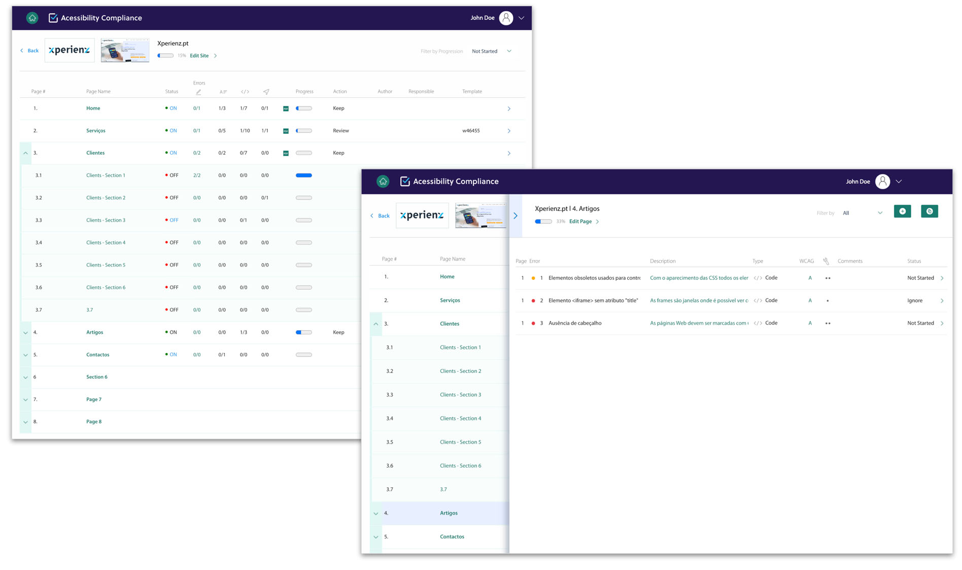
To simplify the presentation of the accessibility evaluation of a website, Xperienz has created the Accessibility App. It allows to check all accessibility errors found on each page of the website, including the type of error (content, design, code, navigation), the errors’ description and possible resolution, as well as the WCAG level and the resolution complexity classification.

Each error refers to a report page which displays the visual location of the error on the web page. To streamline the progression of the correction work by developers and designers, it is also possible to mark the correction of each page as completed.
Want to offer a service accessible to everyone?

Xperienz can help you assess if all users can navigate and complete the necessary tasks on your website, app or digital tool. 

We perform accessibility audits to access compliance with WCAG guidelines, identifying errors and providing a possible resolution so they can be easily addressed by your team. We also conduct usability tests with users with disabilities to identify possible needs, difficulties or obstacles when using the website.

Tell me more
4 years ago

Design Sprints

Prototyping and validating a solution in a week.

Testing and validating ideas in a single week

A Design Sprint is a five-day process created by Google Venture designers which consists in helping organisations answering critical business questions through prototyping and user testing. 

Running a development sprint is ideal for teams who don’t have much time to validate their project. In just five days it’s possible to meet both the team and their users needs, prototype and validate a solution, giving the team the confidence they need to move forward with the project. Validating ideas with real insights reduces the risk of failure and avoids a low return on investment. 

What to expect from a design sprint?
  • Quick and critical project learnings
  • Rapid and functional prototype tested by real users
  • Validated and customer-oriented ideas
  • Groundbreaking and efficient products

Running the design sprint

DAY 1 · Understand 

At the start of the day, the team focuses entirely in understanding and mapping the problem. In the afternoon, the main stakeholders are involved in the project and decide the problem to be solved. 

DAY 2 · Diverge

The second day is exploratory, generating many ideas. In the afternoon, the team sketches them in greater detail, focusing on critical thinking. The recruitment profile for day 5 is defined. 

DAY 3 · Decide

The team critiques the ideas sketched the day before and decides which one will be tested. In the afternoon, they make a detailed storyboard with all the interactions. 

DAY 4 · Prototype 

This day is dedicated to building a quick and semi-functional prototype. The usability tests of the next day are prepared and the interview script written. 

Day 5 · Validate

The last day is completely dedicated to testing the prototype with 5 users. At the end of the day, in a debriefing, the iteration points are identified. 

Advantages of running design sprints

  • Identify problems

    Identifying the challenges and needs of the project. Map out the problem, analise it and pick an important area to focus. 

  • Explore different solutions 

    In this fase there are no wrong answers. Through brainstorming and sketching the team explores different approaches to the problem. In the end, one or two are selected to be tested. 

  • Rapid and functional prototypes 

    An interactive prototype for desktop, smartphone or tablet is created to validate the solution. It’s not supposed to be perfect, but functional and appear real to users. 

  • Test the prototypes 

    The prototype is tested with 5 users, allowing the team to learn from their feedback. In the end, the results are discussed and the team will know what’s the best path to follow. 

Not enough time to validate your project?

If you’re about to launch a new product or feature, Xperienz can help you run a design sprint. We’ll create an interactive prototype and validate your solution with users in our own research lab. In the end, we’ll discuss results and you’ll know how to move forward.

Tell me more
4 years ago

Strategic Design

Designing towards both users and business goals.

Making the right decisions with an eye in the future 

Strategic design is the use of future-oriented design principles and practices to make organisations more innovative and competitive.

It consists of an integrated planning process that examines the relationships between how design and business may complement each other. Rather than taking a traditional design approach that focuses on aesthetics and on designing solutions without investigating the deeper surrounding issues in context, strategic design takes a learning and discovery approach. Decisions are made on the basis of actual facts, by acquiring a deep understanding of the client’s industry, competitors, goals and opportunities to determine what is appropriate, obtainable and makes sense.  

A design strategy should focus on: 
  • Identifying opportunities for action.
  • Identifying existing problems and redefining how they are approached.
  • Helping deliver more complete and resilient solutions.
  • Addressing unmet customer needs.
  • Changing customer behaviours and attitudes.
  • Emerging ideas and trends. 
  • Opportunities to differentiate from competition. 
  • Current benefits and successes to take advantage of. 

A starting point for strategic design is understanding the context  - market, trends, users, customers, partners, internal and external stakeholders - and their behaviour, motivations, values and needs. Diverse research methods can be used to gather real-time insight and information from sources within the organisation, and from the field.  

Solving complex problems

We’re in a time of complex, fussy, interdependent challenges that require organisations to work at the intersection of different areas of knowledge. Traditional methods and thinking are not enough to solve those problems. 

Strategic design can help organisations address the problems of today, navigate through an ever-increasing uncertainty and make good decisions about their future. That is achieved by escaping from the business-as-usual mindset to a future-oriented decision making.

Strategic design benefits

  • Reduced duplicate efforts and valuable solutions

    By collaborating across silos and working in quick iterations, it provides more effective outcomes, reducing duplicated efforts and targeting solutions to deliver real value.

  • All the team focused on the end-goal 

    Involving, aligning and coordinating people with different agendas, priorities and visions towards the same goal.

  • Quick and comprehensive solutions

    Enabling a broader range of questions and developing more complete solutions that consider all aspects of a problem.

  • Future-oriented decisions 

    Making informed decisions about the future of the business.

  • Appropriate problem framing

    Framing problems properly from the start.

Want to make informed decisions thinking about the future?

Xperienz will deep dive into your business, users and industry to set a forward-thinking strategy to make sure your organisation comes up with ground-breaking solutions and stays innovative and ahead of the competition.

Tell me more
4 years ago

Content Strategy

Setting up the framework for all content created.

Planning and managing content to meet business goals 

Content is the main reason people go to a website. However it is often overlooked. Even a website with carefully written content might quickly lose quality if it doesn’t have a well-defined content strategy. 

Content is everywhere and it takes a variety of forms - ads, articles, images, infographics, videos, blog posts, web pages and more. But what should we write about? What’s the point of it? Should it have a more casual or formal tone? To whom are we writing for? 

Content strategy plans for valuable, findable, meaningful content. A content strategy outlines the brand’s message and addresses the goal the organisation has in mind, whether differentiating itself from the competition or making the brand more approachable, for example. It defines a framework that guides the creation, distribution and management of actionable content that helps achieve a specific business objective. 

The main goal is creating a consistent message, voice, and style so that the content created across teams conveys the same business goals, fulfils the right purpose and reaches the right audience.  

What does a content strategy entail? 

  • Managing the roles, tasks, processes, and tools needed to create, edit, maintain and achieve content and ensure it appears to the right people at the right time.
  • Understanding business requirements and helping to identify problems that would benefit from a content solution.
  • Defining the tone and voice of the copy, according to the relevant audience of the brand. 
  • Deciding the policies, standards and guidelines that need to be followed by the team. 
  • Determining how to prioritise, organise, and assess content.

Content Governance 

Content governance consists both on the day-to-day detailed management of content delivery as well as in its long-term management. It provides content creators the same structure and guidelines, to ensure the message conveyed is consisting.

A good content governance:
  • Determines priorities. 
  • Defines detailed guidelines, standards, policies, procedures and tools about how content should look, behave, and interact with users.
  • Assigns content ownership and roles to people within the organisation. 

Planning a content structure

Organisations need to keep up with the increasing demand for more and more content while making their content relevant for the needs of their target audience. That’s why it’s important to structure content in a way that it can take different forms on the site. 

Modular content

By analysing the structure and purpose of content, it’s possible to break it down into modular components that can be delivered to any device and easily modified for particular audiences and purposes.

Shared and reusable modules can also improve content quality and consistency. 

Need help planning and managing your content?

If your content is unorganised, lacking a clear voice and consistently confusing to users then Xperienz will help you plan and implement a content strategy. We’ll develop a strategy tailored to your users’ interests, ensuring your business hits the goals and stays competitive. 

Tell me more
4 years ago

Interaction Design

Creating engaging, easy-to-use interfaces.

Designing easy-to-use digital products

Interaction design (often abbreviated as IxD) refers to the design of interactive digital products and services according to the way users will interact with it. The interactions are every element on the screen that users might swipe, click, tap or type, such as buttons, links, form fields and more. 

To interaction design it’s fundamental to understand how users and technology communicate with each other as well as understand users’ needs, limitations and contexts. By knowing that, designers can anticipate how someone might interact with the product or service and customise it to suit their demands, fix problems early in the development, and come up with innovative ways of doing things. 

The five dimensions of IxD

  • Words

    All text (like button labels, for example), which helps give the right amount of information to users. Words should be simple to understand and communicate information easily to users. 

  • Visual representations

    All graphics, diagrams, icons or images with which users interact. They usually complement the words used to communicate information to users. They should be used in moderation so not to overwhelm them.  

  • Physical objects or space

    The medium through which users interact with the product or service. It can be the physical hardware, like a mouse or a keyboard, or a mobile device. 

  • Time

    The time during which users interact with the interface. It can be animations, videos and sounds. 

  • Behaviour

    The emotions and reactions of users when interacting with the product. 

Using micro-interactions to improve the user experience 

When users are navigating through a website or an app they need to know what happens when they perform an action, whether swiping left, adding items to a shopping cart or clicking a button. That’s why micro-interactions are important as they’re used to provide meaningful feedback to the user. Besides, well-designed micro-interactions can create a more enjoyable experience. 

Scroll bars, pull-to-refresh animations, swipe animations or email notifications are some examples of micro-interactions. 

Micro-interactions are also used to: 
  • Encourage engagement and make users interact with the interface
  • Save space on mobile by hiding a few action items using gestures  
  • Communicate information clearer by using visuals and animations
  • Turn bored loading screens into something interesting
  • Teach the user how to use the interface
  • Help users prevent errors
  • Display system status
  • Perform quick actions 
  • Direct users attention 
  • Communicating brand

Want an interface that meets your users’ needs?

Xperienz applies research to the design of simple, easy-to-use interfaces. By learning all about your users we’re able to design a solution that matches what they want and also benefits your business. 

Tell me more
4 years ago

Interface Design

Designing attractive and intuitive interfaces to ensure users can accomplish their tasks.

Designing easy-to-use interfaces 

Interface design refers to the design of user interfaces for software, websites or applications. It is more than deciding which color to use or where to place the main menu. To design an attractive and intuitive user interface is essential to anticipate what users might need to do and ensure that the interface has elements that are easy to access, understand and use to facilitate the tasks they need to accomplish. 

Making complex systems simpler 

Designing a clear, easy-to-use interface is particularly important when dealing with complex apps that comprise a large amount of screens. Adapting interface design to the users’ tasks and processes and creating innovative standards can make navigation easier for them.  

Creating a design responsive interface

No matter the complexity of the system it’s important that it works well in any device - smartphones, tablets and desktops. If a user is navigating through an organisation’s website on his desktop and decides to switch to his smartphone, the website interface should automatically resize, hide, shrink or enlarge according to the new device specificities. 

By taking a responsive design approach, both the design and the development of products respond to the user’s preferences, behaviour and environment. 

Taking a touch-first approach 

A touch-first interface is designed to prioritise touch as the main input method. In order to design a touch-friendly device it’s important to understand how people hold the wide variety of gadgets available - phones, tablets, laptops - as they’re operated very differently and each have their own specific UI needs. 

Designing a touch-first interface for both websites and apps prevents users from having to learn new patterns and provides a better experience if they access the website or the app on different devices. 

Want your users to navigate a clear, intuitive interface?

Xperienz will learn all about your users to design an interface that meets their goals and lets them easily complete the necessary tasks on your website or app.

Tell me more
4 years ago

Design Systems

Creating a consistent design language to build more cohesive products.

Designing cohesive products across the organisation 

Most of today’s biggest organisations have a wide range of channels and products. They might have a website, an app and a blog, for example. However, if there isn’t a common language, design and development teams in order to solve complex problems will quickly end up building distinct components and defining their own standards and workflows, leading to inconsistency across the organisation. As users move from one product to the other they notice those inconsistencies and might experience confusion. There’s where design systems step in. 

“A design system offers a library of visual style, components, and other concerns documented and released by an individual, team or community as code and design tools so that adopting products can be more efficient and cohesive.”

Nathan Curtis

A design system explains how the team should design products. Besides including a style guide and a pattern library, it also comprises the design principles, rules and guidelines, as well as ready-to-use components and code snippets for developers. 

Some outputs of a design system:
  • Style guide

    A document that includes the organisation’s graphic styles, colours, fonts, iconography, tone of voice and how they should be used. 

  • Pattern library

    Collections of reusable user interface components that are shared across teams and aggregated to design products.

  • Design principles

    Clear standards for the product team that replace subjective ideals. 

Benefits of working with design systems 

  • Time-savings 

    Having common patterns saves precious time that can be invested in creating better experiences that meet users’ goals

  • Better and more predictable user experiences

    Improving the design and user experience of products and services will create more predictable experiences for users

  • Possibility to test high fidelity prototypes 

    Easier to build high fidelity prototypes to test with real users and learn from their insights

  • Eliminate redundancies

    Reducing inefficiencies and replicated work in the design and development process

  • More efficient work 

    Efficiency for both designers and engineers, enabling better design and faster builds

  • Better collaboration across teams 

    Improved team communication and collaboration, with more cohesiveness and consistency 

  • Clear brand identity and language

Need to create a shared language across your organisation?

Xperienz can help facilitate the work of your teams by creating a consistent design language. With the right tools both designers and developers will design products at scale with less effort and more quality.

Tell me more
4 years ago

Information Architecture

Organising, structuring and labelling content to help users find information and complete tasks.

Structuring information so users can find what they need

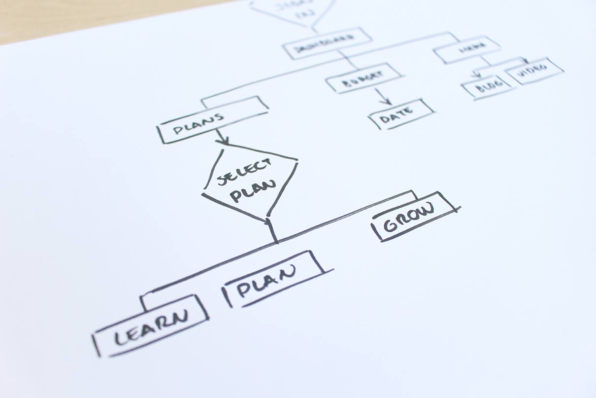
Information architecture (IA) focuses on organising, structuring, and labelling content of websites, web and mobile apps in an effective and logical way. The goal is to help users find the information they need and complete tasks without much effort. By having a clear IA, with well-organised and well-structured content, users will also find the product or service more usable. 

“We help our users to understand where they are, what they’ve found, what to expect, and what’s around.”

- Peter Morville

What does it take to create good IA?

An IA that works well meets the needs of people, content and context.  

  • Content

    A good content understanding, including knowing what content exists, what should exist and what content is needed, supports an information architecture that works well for current and future content.

  • People

    It’s important to know enough about people in order to be able to group content in a way that makes sense to them. 

  • Context

    Creating an IA that works both for people and business goals by considering aspects like funding, politics, culture, technology, resources and constrains.

What are the main components of IA?

Navigation 

The set of actions that helps users to browse or navigate through information within a website or an app to achieve their goal.

A complex website might include several types of navigation. Understanding how they can work together to provide a sense of control and confidence to users is essential to design an efficient, easy-to-use website. There are several types of navigation systems, for example: 

Hierarchical

A menu with a hierarchical structure that matches the website’s structure. It allows users to navigate directly to a section of the website several levels below the top. 

Linear

When web pages are accessed in a sequential manner (i.e. learning websites). 

Contextual

Used to point users to related pages, supporting associative learning. (i.e. “related products” or “you may also like” on e-commerce websites or navigation links relating to resources in articles).  

Organisation schemes 

The categories in which information is placed. Most sets of content can be organised in multiple ways. The challenge is finding out what works best for the users, the content and the project goals. 

Examples of organisational structures include:
  • Category

    Grouping content with the same characteristics (i.e. supermarkets group together dairy, fruit, drinks, cereals, etc.) 

  • Chronological

    Content organised by order of creation (i.e. in social media feeds new posts appear before older ones as we scroll down)

  • Location

    Content organised according to a specific or global place (i.e. city maps, bus routes or products organised by room in decor and furnishing websites) 

  • Alphabetical

    An A to Z index (i.e. to find a specific brand name in a shoes website) 

  • Continuum

    Arranging content by the quantity of a measurable variable, such as price, weight, size (i.e. sorting clothes items into price ranges)

Searching systems 

The way users search for information within the website or app. It’s particularly effective for websites with a great quantity of information where users might easily get lost. It might be entering words in a search engine, scanning for terms in a numbered list or filters. 

Labelling systems 

The ways information is represented. Labels are created to refer to a large amount of data in a few words. To be effective labels should build a send of familiarity, so they should not change from page to page. Also, the level of terminology should be appropriate to the target audience. 

Methods to design or evaluate IA

Card Sorting 

Card sorting provides useful information for structuring the information of a website and helps to define the website’s navigation. Card sorting exercises can be done individually or in group. People are given 50 to 100 cards representing the content to be tested and asked to organize those cards in logical groups. Then they must give a name to each group. 

Card sorting exercises can be open or closed. In open card sort the name of the groups created are suggested by participants. They are used to propose an alternative structure. In closed card sort participants are asked to sort content items into pre-defined categories.

Content Inventory 

A content inventory is a detailed and structured list of all the content of a website or app. Each page contains a small description of its content, along with correction notes, the author and revision date. 

A content inventory is a useful tool when redesigning a website and a startup base for reorganising content. It’s essential to perform an effective audit to a website as it helps to understand what content is available, if it is located correctly, if it is up-to-date and which content should be removed or revised.  

Need support with your website’s information architecture?

A poor navigation system might be the reason businesses lose money as users can’t find the product or information they’re looking for.

By performing content audits and using card sorting exercises, Xperienz can help you develop innovative, user-centered navigation. We’ll ensure users move logically through your web pages and get closer to completing the tasks. 

Tell me more
4 years ago

TESTE

The Process

blablabla

-lorem ipsum

blockquote

  • Lorem Ipsum Dolor amet asae Lorem Ipsum Dolor amet asae

    lorem ipsum dolor amet asae lorem ipsum dolor amet asae lorem ipsum dolor amet asae lorem ipsum dolor amet asae lorem ipsum dolor amet asae lorem ipsum dolor amet asae lorem ipsum dolor amet asae 

  • 1

    lorem ipsum dolor amet asae lorem ipsum dolor amet asae lorem ipsum dolor amet asae lorem ipsum dolor amet asae lorem ipsum dolor amet asae lorem ipsum dolor amet asae lorem ipsum dolor amet asae 

  • 1

    lorem ipsum dolor amet asae lorem ipsum dolor amet asae lorem ipsum dolor amet asae lorem ipsum dolor amet asae lorem ipsum dolor amet asae lorem ipsum dolor amet asae lorem ipsum dolor amet asae 

  • 1

    lorem ipsum dolor amet asae lorem ipsum dolor amet asae lorem ipsum dolor amet asae lorem ipsum dolor amet asae lorem ipsum dolor amet asae lorem ipsum dolor amet asae lorem ipsum dolor amet asae 

4 years ago