UXLx Masters — Wrap-up
February 24, 2021
From 10 to 12 February attendees from 25 countries and 14 world-renowned UX experts joined online for 3 days of learning. The programme included 12 live masterclasses, 2 keynotes, 2 live podcasts, and more. People had the chance to network and share ideas with their peers through speed networking during breaks and a networking dedicated Slack channel.
If you didn’t had the chance to join us online, if you missed a couple masterclasses you also wanted to attend or if you simply want to remember the main takeaways of each masterclass, we’ve summarised these amazing three days into this article.
DAY 1
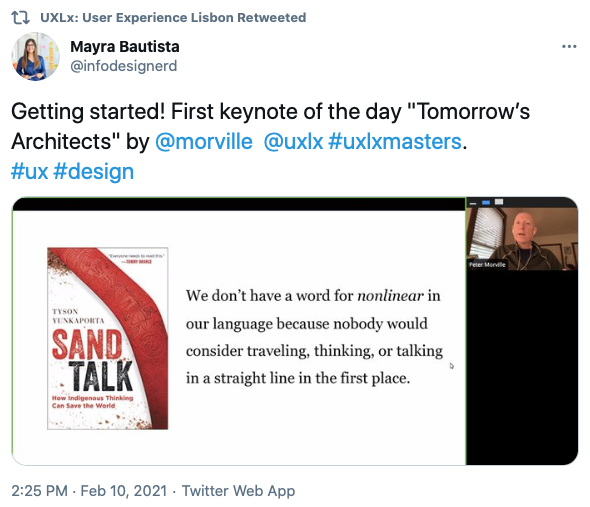
Tomorrow’s Architects by Peter Morville
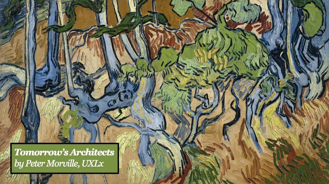 Peter started and ended is talk with the painting “Tree Roots” by Vincent Van Gogh. While in life he was considered a madman and a failure, in death is paintings became priceless. Van Gogh saw reality differently and help us change our perception.
UXLx Masters started brilliantly with an inspiring talk by Peter Morville about emancipating information architecture (IA). Peter reframed IA as the design of language and classification systems to change the world. He pointed out IA’s potential to create environments for understanding.
Peter covered aspects like language, classification, culture, madness and death.
“When we see things one way, specially if that way is useful, we’re unlikely to see differently.”
“We are all tomorrow’s architects.”
UX Strategy by Jared Spool
Jared Spool, one of the most knowledgeable communicators about user experience, joined the event for a masterclass on UX strategy.
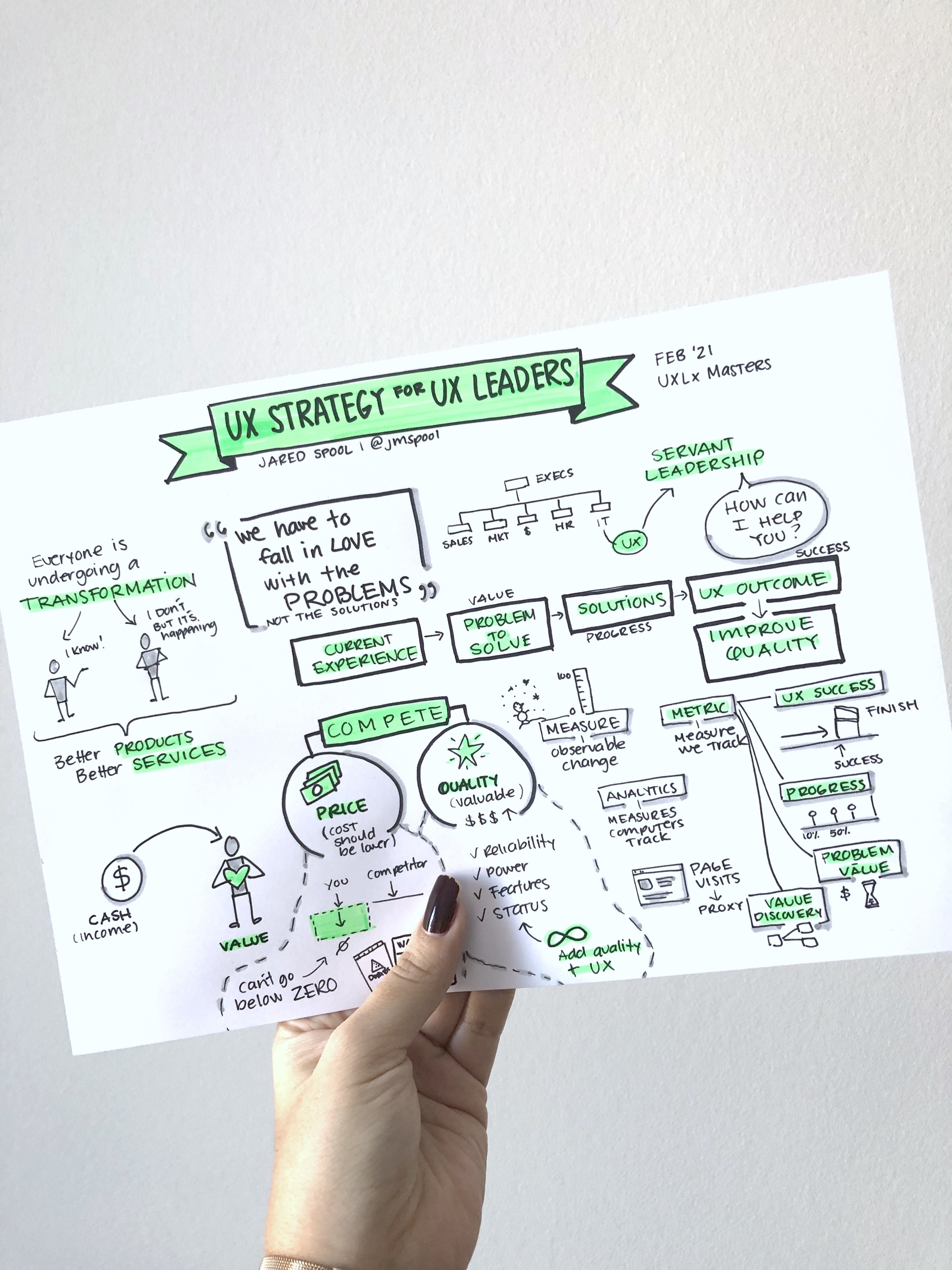 Masterclass sketchnote by Mayra Bautista
 The first topic Jared focused on was the two ways an organisation can choose to compete on — price or quality.
Price: If a company decides to follow the price path it will have to keep focused in reducing costs in order to have a product with a lower cost, to be able to sell the product just above cost. But you can only reduce a price so far and that makes this path a limited one.
Quality: Quality is infinite as you can always add more quality to your product. By choosing the quality path, the company will have a more expensive product but it will compensate with the extra quality, so in the end it will be a more valuable product.
He pointed out that the way to improve quality infinite times is User Experience.
“There is always room for improvement in the experience, thus there will always be room for improving the quality of a product.”
If this doesn’t work you have the possibility to talk money to them by showing businesses the cost of poor user experience. To do so, you can control and collect data from different places, for example:
- Increase of support requests: which features do clients flag the most?
- Lost of sales: where are sellers losing their customers in the process?
Then Jared shined a light overt the concept of Servant Leadership. It basically consists of not waiting for others to come ask for you to help with their issues. Be proactive and ask others if they need help, instead.
By using your strengths to help others improve their “part” so that all of the product/company can benefit with a better experience.
Jared went through 4 different types of metrics and where they can be collected during the process of reaching an UX outcome (improvement to the product):
- UX success metrics: measure the moment you achieve your ‘improvement’ (UX outcome stage);
- UX progress metrics: mid points during progress (solution stage);
- Problem value metrics: measure the problem that keep you from getting to success (problem stage);
- Value discovery metrics: providing new things based on the collected data (eg. amazon recommended section)(solution stage).
Finally, Jared talked about how to move from reactive UX leadership to proactive UX leadership.

Lead with Confidence and Create Better Together by Denise Jacobs
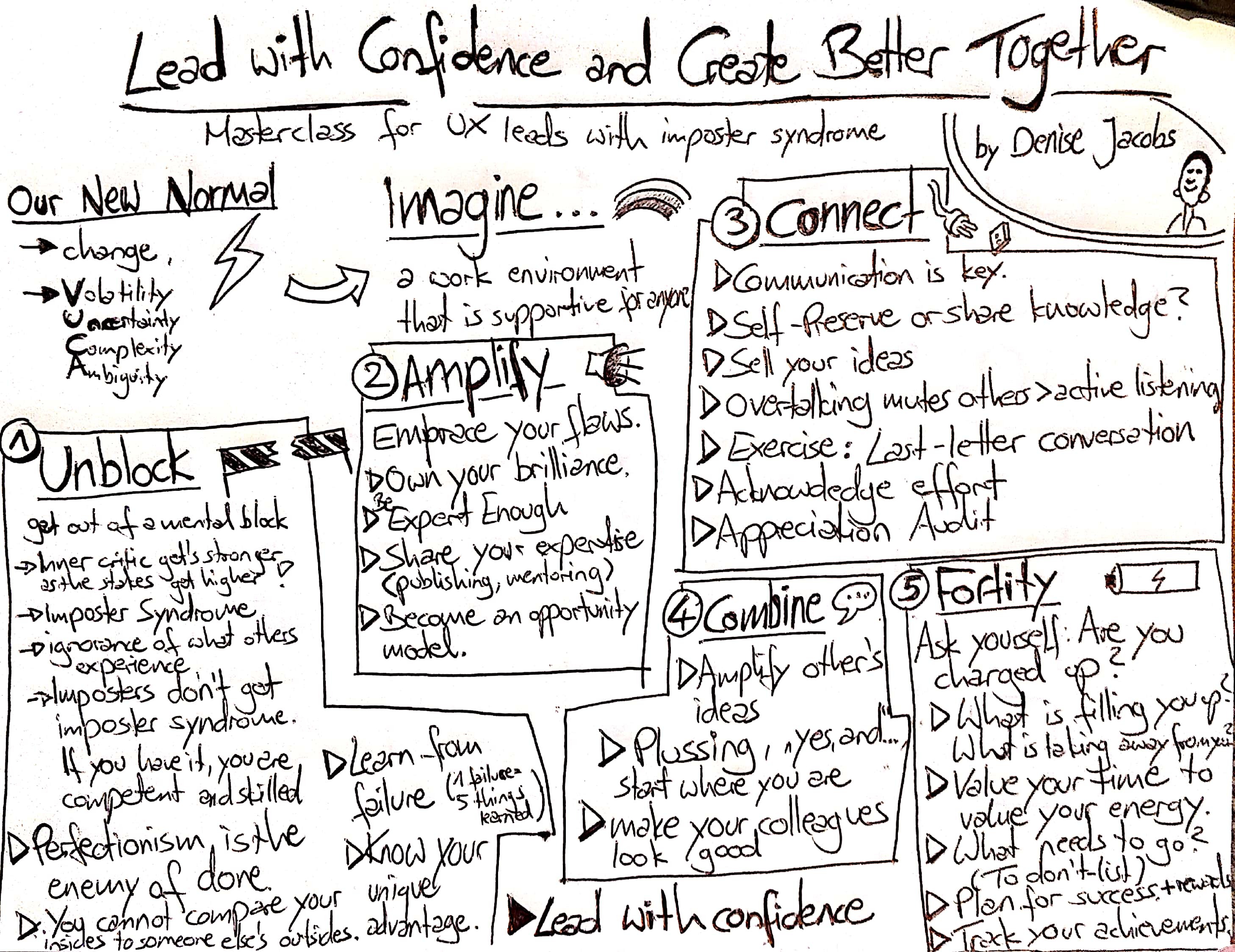 Masterclass sketchnote by Clara Gies
 Let’s start by saying this — what a spirited and inspiring masterclass! Denise certainly knows how to captivate an audience (which is certainly not an easy job in an online setting) and motivated everyone to banish their inner critic and be more confidant.
Denise started by talking about our new normal, how much has changed in a small period of time (due to the worldwide pandemic) and how we’ve had to be adaptable. She then prompted the question “how can we be the leaders we know we need to be?”
Throughout the session she covered 5 steps to be help us be more confident and become better leaders:
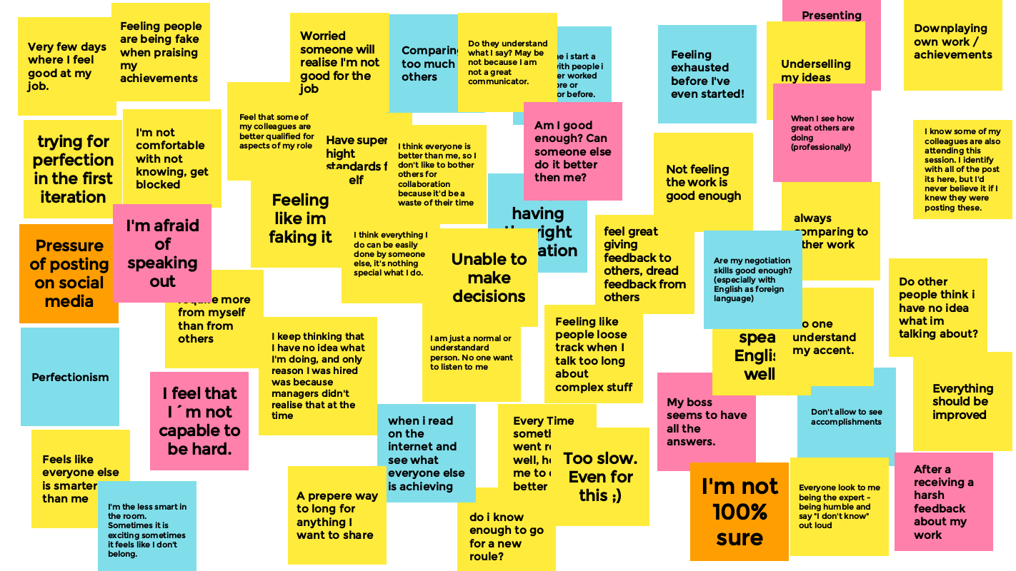 Attendees shared how impostor syndrome shows up for them
 1. Unblock — It’s crucial to get rid of the mental blocks that get in the way. We keep wondering “Do I have what it takes?” because inner critic gets stronger as the stakes get higher. That takes the importance of overcoming impostor syndrome and how people set different standards for themselves vs. Others, simply because they can’t internalise their successes. However, Denise let everyone know that impostors don’t get impostor syndrome. You will only experience impostor syndrome when you’re competent and skilled (Impostor Syndrome Paradox). She also talked about the fear of failure and how we must learn from it.
“You cannot master something without failing.”
2. Amplify — This step is all about stop trying to fit someone else’s mold and embrace who you are. We should own our brilliance and expertise and share it with others. You might become an opportunity model for someone — not a role model — in a way that we can model what’s possible, how to achieve success in a certain role.
3. Connect — Communication is crucial and keeping your ideas to yourself is detrimental. Active listening is key and acknowledging effort is of major importance.
4. Combine — This step is about amplifying the ideas of others. Instead of saying “Yes, but…” we should be saying “Yes, and …”
5. Fortify — Instead of asking ourselves “why do I fell so lazy?”, we should ask instead “why does my body need so much rest?”. It’s important to value our time to value our energy. We should consider what needs to go and do a “To Don’t List”. Denise also talked about how we should plan for success and track our achievements daily. We can even plan our rewards in advance.
In the end she highlighted that by stepping into our power, we become stronger leaders and help our team create better together.
Design Principles as a Lever for Change by Kim Goodwin
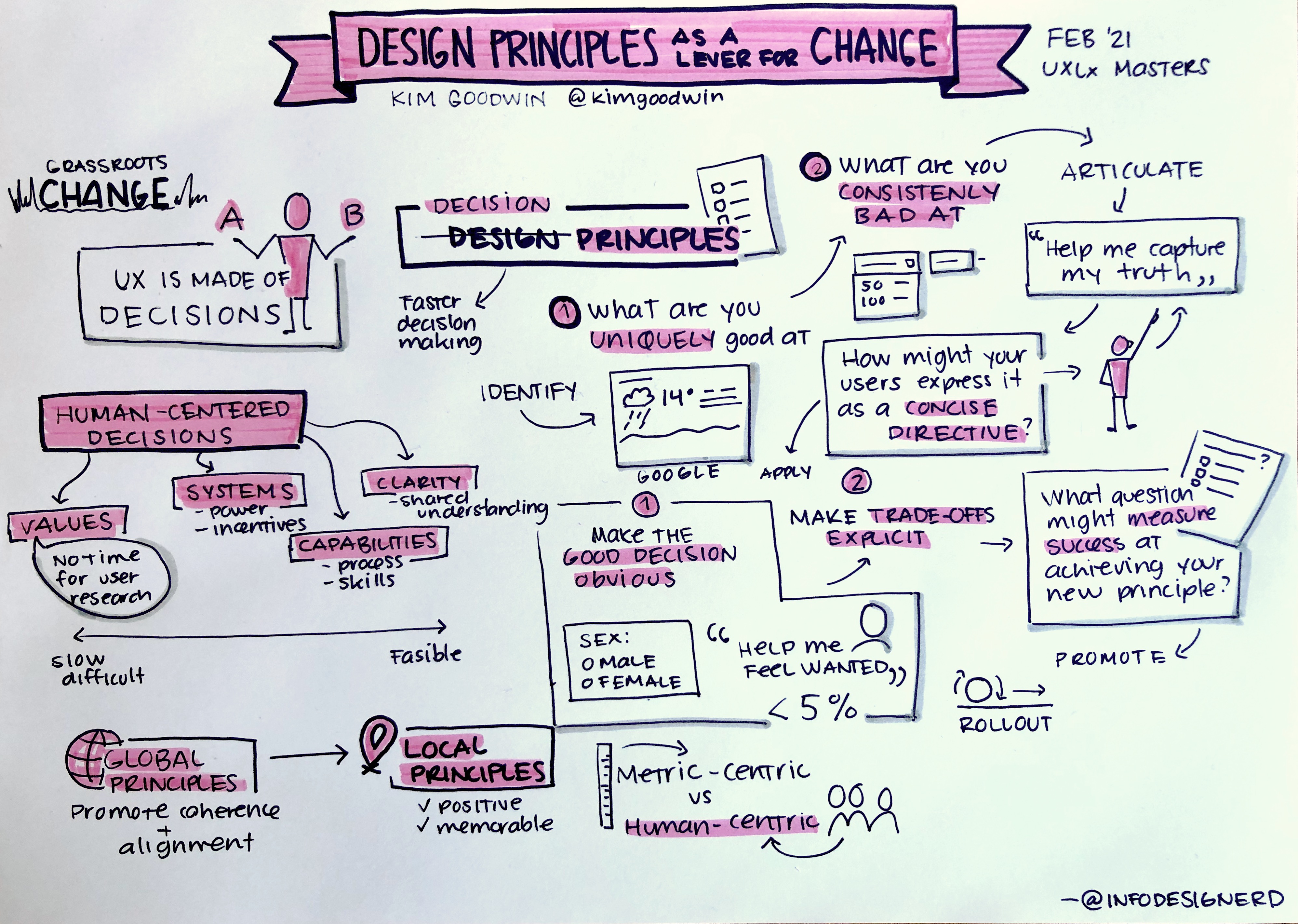 Masterclass sketchnote by Mayra Bautista
 “A user experience is not made of pixels, content, or code. A user experience is made of decisions.”
Kim explained that there are four aspects that enable human-centered decisions:
- Values: who or what we believe in prioritising
- Systems: how power & incentives work
- Capabilities: process, skills & knowledge
- Clarity: shared understanding of how to apply values
She proposed that design principles should be referred as decision principles. They’re an aspirational, explicit directive that helps a team make decisions consistent with user needs and organisational values.

Kim defined that a principles list is a manageable collection that includes existing, consistently-applied principles as well as desirable new ones. Defining such list can have advantages such as making values easier to apply, streamline decision-making and identify and prevent UX problems. She then explained 4 main topics regarding principles:
- Identify ideas to express as principles;
- Articulate effective principles;
- Apply principles in decisions;
- Promote (and sustain) adoption.
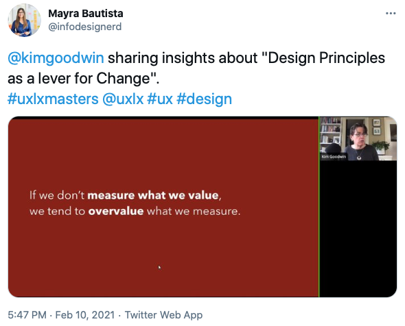
You’re not doing usability testing? What are you, crazy? by Steve Krug
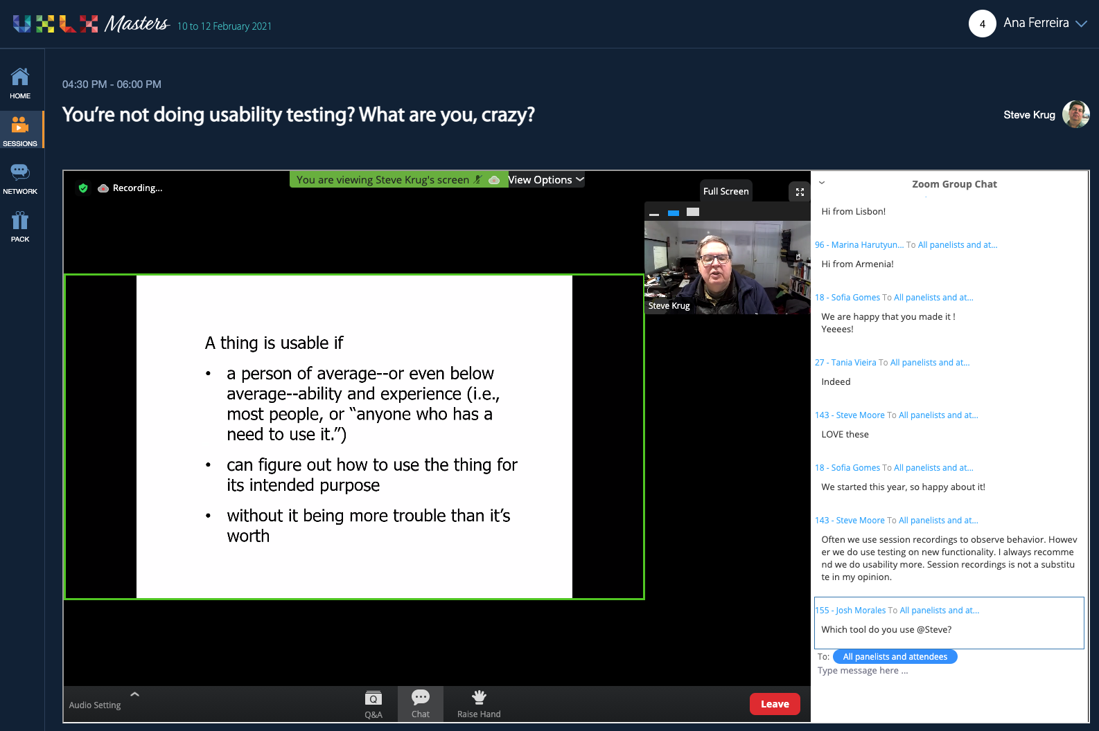
How great it is to learn more about usability testing with someone who masters this subject. Steve started by showing some examples of how usability problems aren’t hard to find: sometimes they just slow us down, sometimes it’s the wording, sometimes it’s the UI, etc.
“We’re all users but we’re not our users. We don’t appreciate how diverse they are.”
The biggest problem when designing a product is that we’re too familiar with it. We can’t unknow what we know about it. The solution for this problem is, of course, usability testing. Steve presented a very simple definition of usability testing:
“What is a usability test?
Watching people try to use what you create… while thinking out loud. The end.”
During the session, Steve conducted a live demo usability test to show how to talk to the participants, how to formulate the questions and how to provide feedback during the test so that people feel more at ease.
He then gave attendees some tips to improve usability testing habits, for example:
- Start earlier than you think makes sense;
- Do tests recurrently — Steve recommend doing 3 tests a month;
- Focus on a small number of the most important problems;
- Tweak, don’t redesign: when fixing problems, try to do the least you can do.
Towards the end of the session, Steve also talked briefly about doing remote testing and left some room for Q&A.
Voice of Design Podcast
Erika Hall, Mike Monteiro and Peter Merholz joined the event for a special live edition of the VOD Podcast.

DAY 2
We kicked-off day 2 of UXLx Masters with the fun UX Masters Quiz Show. Bruno, our host and conference curator, made a series of questions about the masters and contestants had to guessed which masters did what. We found out that Jeff Gothelf worked at a circus (as the sound and lighting technician) and that Margot Bloomstein worked with Zach Quinto (who played Spock in the most recent Star Trek films).
Design for Trust — Our Opportunity, Our responsibility by Margot Bloomstein

Margot Bloomstein started her masterclass talking about the problem around trust and cynism.
“When people lose trust, they grow cynical.
When people gain confidence and feel empowered, they regain trust — and hope.”
People don’t trust brands the way they used to mainly due to inconsistent messaging. Users look at the world with more skepticism than trust.
This represents a problem for designers, information architects, content strategists, marketeers but it’s also an opportunity. In order to regain our audience’s trust, we must empower them with useful, usable information — not false or oversimplification.
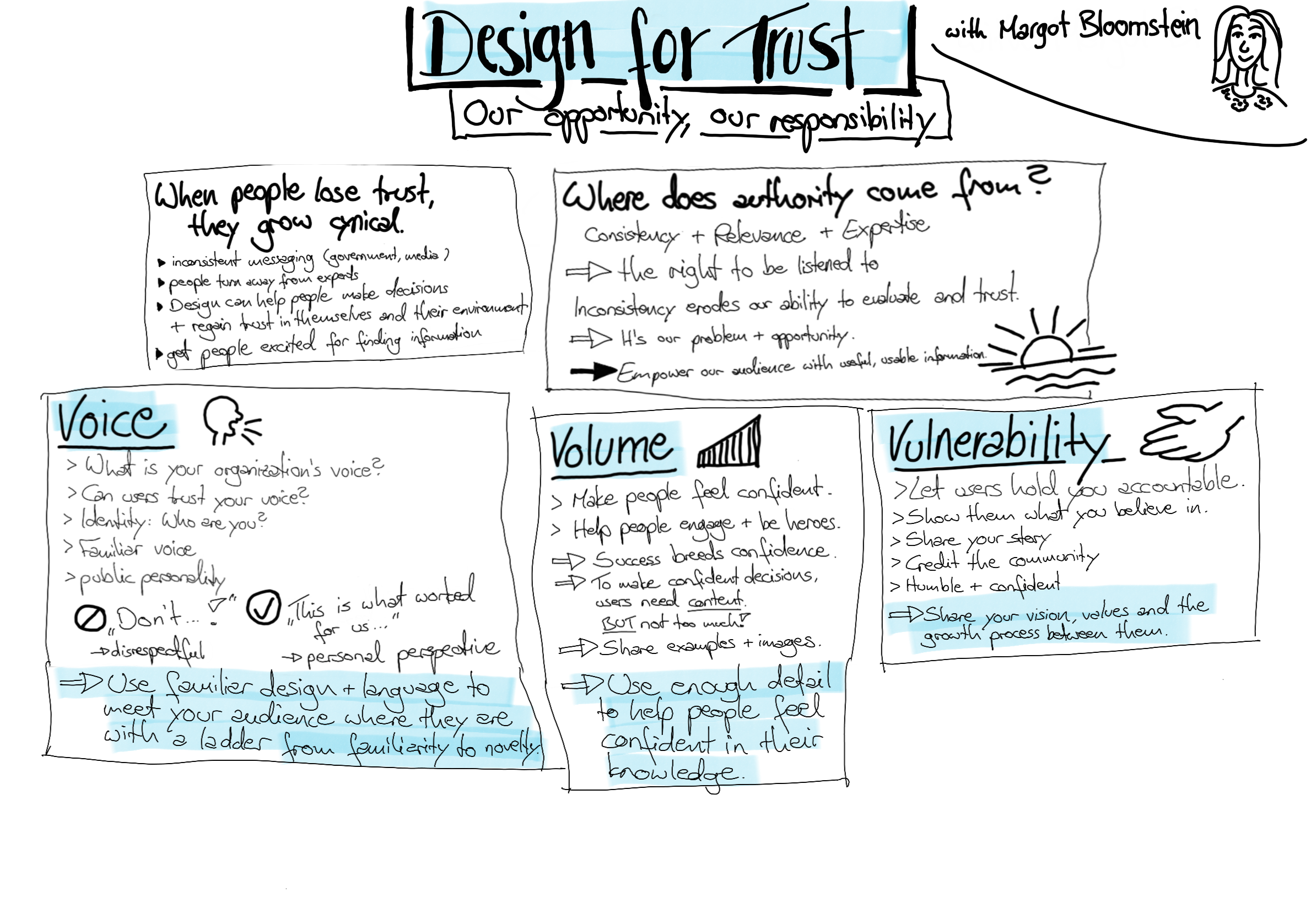 Masterclass sketchnote by Clara Gies
 Margot then explored three main components:
- Voice: It helps your audience understand who you are, as a brand; using a consistent voice, in a plain language that people can understand makes them feel confidence in the brand and in themselves;
- Volume: It refers to how much you communicate; how do you determine how much content is enough? — user research, measure customer satisfaction, etc.;
- Vulnerability: It’s the risk that we take on for connection; it’s the cost of transparency; finding greater loyalty from customers; allow the audience to hold you accountable.
Offering a consistent voice, the right volume of detail, and growth through vulnerability will help brands earn trust from their customers. By empowering their audience, brands will rebuild customers trust in themselves, in the brand and in the world.
Objectives and Key Results: focusing on customer outcomes to drive product roadmaps, alignment and agility by Jeff Gothelf
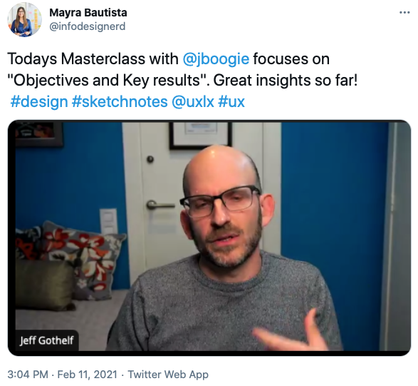
In this masterclass, Jeff focused on what are objectives and key results, why to use them and how to make them work. Attendees did a few exercises around this which helped better understand what to look for when defining them.
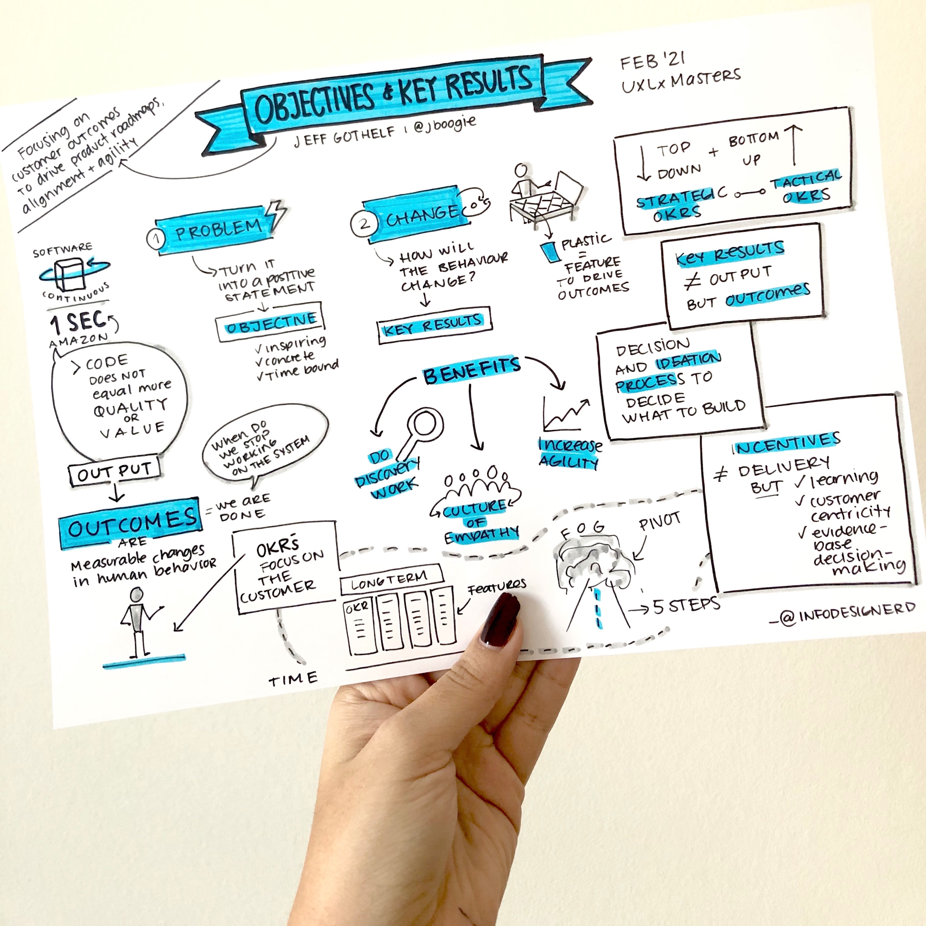
Outcomes refer to measurable changes in human behaviour. They tell us when we’ve delivered customer value. We need a new way to set goals and measure success. That way is objectives & key results (OKRs). Objectives are what we want to achieve. Key results is how we know we did it.
Jeff provided some tips on how to write a good objective. It must be inspiring, significant, agressive, yet possible. An objective has to be concrete, provide value, and be time bound.
As for a good key result it should be quantifiable, aggressive, verifiable on evidence.
 Masterclass sketchnote by Mayra Bautista
 OKRs have 3 main benefits:
- Force teams to do discovery work to determine which solutions are most likely to succeed;
- Build a culture of empathy and customer-centricity;
- Increase organisational agility.
“OKRS reduce risk, drive agility, focus on the customer and reflect modern ways of working.”
Inclusive, by Design: intentional inclusion by Derek Featherstone
Derek is an authority on accessibility, web design and development and joined us for a masterclass on inclusive design. Although there are many lenses on inclusion, Derek focused only on accessibility for people with disabilities.
Derek started by stating the difference between accessibility and inclusive design. While accessibility is about measuring how easy something is to use by people with disabilities. Inclusive design is a process. “Diversity, by default” should be the position taken in an inclusive design process.
Accessing how easy is the product for people to disabilities to use is normally considered in the end of the design process. However, that’s not the way. The way should be finding ways to engage more people with disabilities earlier in the processs. We have to show that their value is helping guiding us through the entire process, not confirming that we made the right decision in the end.
To help us understand a bit better the problems people with different disabilities face Derek proposed an exercise. We should consider the activity of building a journey map and point out which difficulties people with different disabilities (seeing, hearing, dexterity, mobility, speech, neurodiversity and brain function) would experience.
“Inclusive design is the most effective, ethical, responsive way to be accessible.”
Practical Metrics for Designers by Kate Rutter
 Masterclass sketchnote by Mayra Bautista
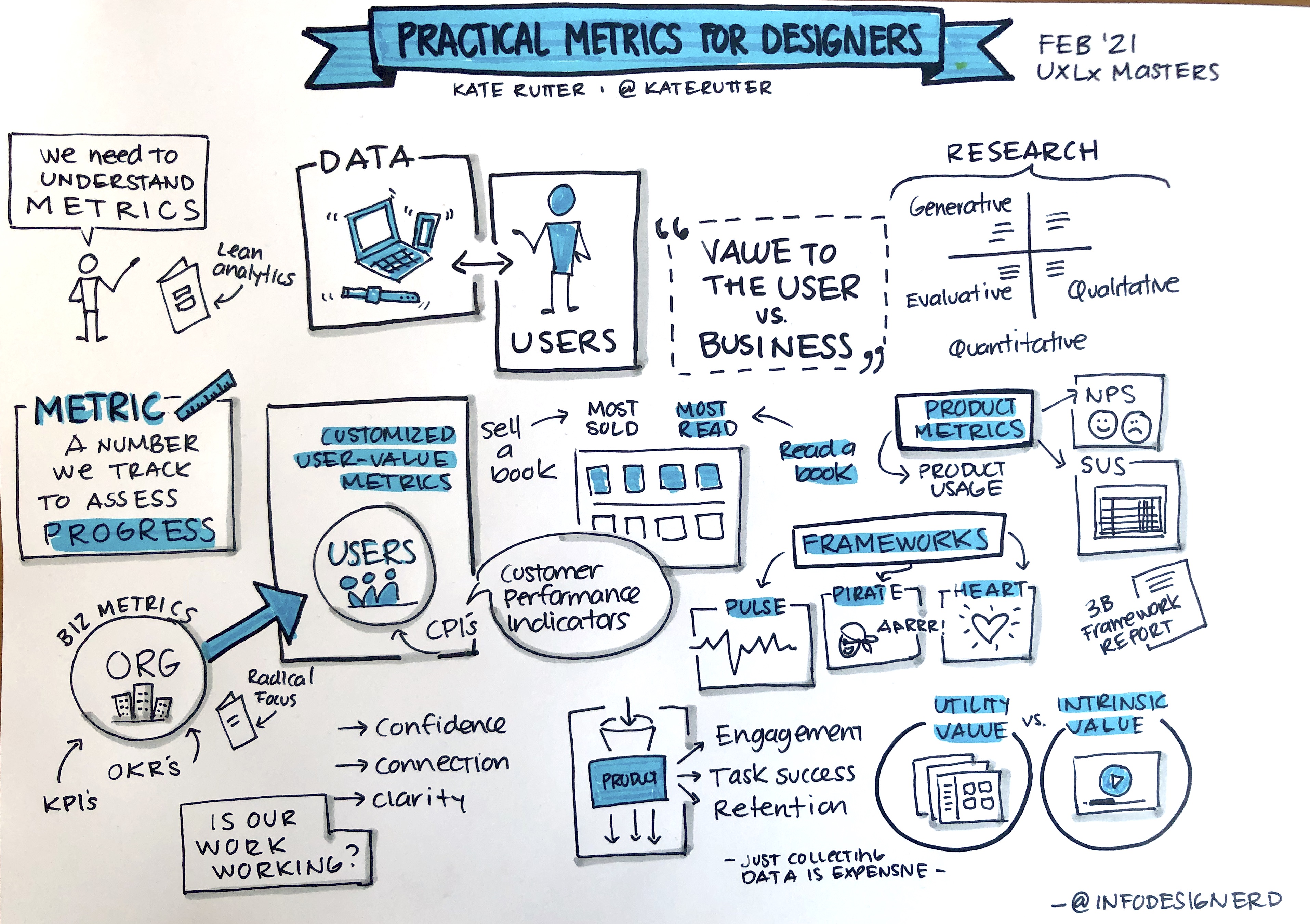
 Kate Rutter started by talking about traditional business metrics (like OKRs and KPIs) and how they access the financial health, productivity and growth of and organisation to then introduce a different kind of metric — practical metrics.
Customised user-value metrics are product-specific, usage-based and user benefit.
Finally, she pointed out a few questions to find good behaviours to measure:
- Who is our user?
- What do they need & what do they do?
- What can our user do with our product that they can’t do without it?
- What actionable metric appropriately measures the key use?
- What interaction events must be captured to calculate the metric?
“Products that make our users’ goals become real.”
UX Podcast
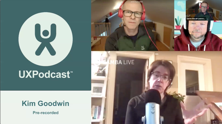
The second day of UXLx Masters ended with a special UX Podcast episode by James Royal-Lawson and Per Axbom. Featuring Kim Goodwin, Kate Rutter and Pamela Pavliscak.
DAY 3
The last day of UXLx Masters started with a session specially aimed at coffee lovers. Bill Scott joined us (quite early in the morning since he was on the West Coast) to share with us a bit of his pursuit for the perfect coffee.
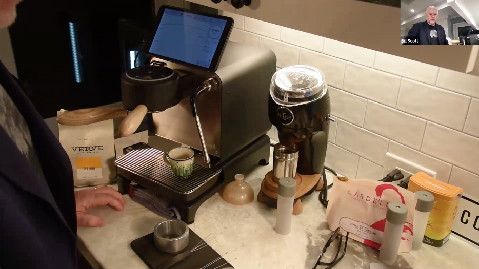
Bill Scott on his pursuit for the perfect coffee
The UX of AI: Using machine learning in your everyday practice and products by Josh Clark
“How do we use machine learning in a way that amplifies human decisions?”
That’s one of the questions Josh Clark addressed on his masterclass.
There are different types of machine learning (ML) which we can easily find in the apps we use everyday.
- Recommendation: For example, Slack that matches subjects to inputs in search;
- Prediction: Keyboards that predict words you may want to use based on what you’re writing;
- Classification: Google Forms that suggests an answer type based on your question;
- Clustering: Similar to classification but only done by ML (no human intervention);
- Generation: Describing a web component and the system develops it and makes it functional (text to code).
Although machine learning can be a helpful tool in a close future, it needs to be tended by humans.
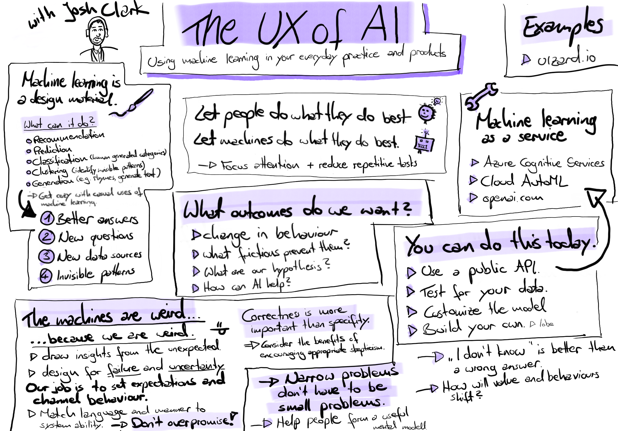
Masterclass sketchnote by Clara Gies
Journey Maps Ops: a customer-centric management tool for agile organisations by Marc Stickdorn
Marc Stickdorn joined us all the way from the Austrian Alps to tell us all about journey maps operations, a customer-centric management tool for agile organisations (a customer can also be a citizen, employee, user, patient, etc.).
For the first part of his masterclass, Marc focused on the journey map typology. There are several visual components in a journey map, namely:
- Steps: any activity of the main actor (waiting, walking, etc.);
- Touchpoints: interactions with the brand, involves different channels (personal contact, smartphone, TV, etc.);
- Moments of truth: decisive steps in a journey, situations that make or break the experience.
Then there are also other components like storyboard (photos, icons, any kind of visual elements), emotional journey (from positive to negative), channel overview (communication or distribution channel: documents, face-to-face conversation, etc.), text lane (use for description details for each step, needs, pain points), dramatic arc (high engagement to low engagement) and backstage processes (map out what is happening behind the scenes).
There are six aspects to consider when evaluating journey maps:
- Reliability: assumption or research-based;
- State: current or future-stage;
- Main actor/perspective: who is the main actor of the journey map? a customer? an employee? a user? a citizen?;
- Scope and scale: high-level or detailed perspective;
- Focus: product or experience-centered;
- Lanes and level of depth: visualisations / data.
Journey maps can be used to understand and visualise, keep research data, plan and communicate, align teams, innovate, …
There are 3 types of journey maps:
- Workshops maps: useful for co-creative workshops; research and prototyping;
- Project maps: use within projects; use it internally or externally; survive throughout the entire project;
- Management maps: overview maps, up to date.
Different problems arise when working in an agile/lean process. Different silos within an organisation have different focus points, two teams plan with the same resources, each discipline works in a different way, language varies per expertise, tools are incompatible and perspective is not based on a shared story. So for the second part of the masterclass, Marc explained how journey map ops can be the key to establish a customer-centric base structure for everyone.
In journey map ops there are:
- Journey map coordinators— responsible for a certain part of the journey; reach out to different teams; coordinators regularly meet (once a month, quarterly, weekly);
- Journey map councils — put all the information on the table, see if there’re contradictions between projects.
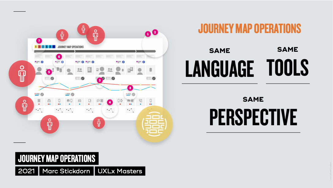 Slide from Marc Stickdorn’s presentation
 Journey map operations creates the ideal environment for teams working in agile organisations as it establishes the same language, the same tools and the same perspective.
Multimodal Voice Design by Cheryl Platz

Cheryl started her masterclass with a quick voice design refresher.
“The future is multimodal, because humans are multimodal."
A mode refers to a type of communication, and humans communicate using their senses. A multimodal interaction is an exchange between a device and a human being where multiple input or output modalities may be used simultaneously or sequentially depending upon context and preference.
There are 5 communication modalities: visual, auditory, haptic, kinetic and ambient.
Accessing how rich is the information (low or high density) and how close the device is to the customer (close or long range) helps us place experiences in one of the four categories of the spectrum of multimodality (anchored, adaptive, direct and intangible).
Transitions between modalities are crucial for the multimodal experience. They can be voluntary (customers transfers to a different modality because they believe the new one will be easier or more appropriate) or involuntary (the current modality is deemed insufficient by the system and the customer is forced to switch to continue their activity).
Finally, Cheryl talked about adding visuals to voice. What a customer sees when interacting with a device should be informed by the microphones. With far-field mics you can’t assume the customer is looking at the device so visuals shouldn’t be required to complete key tasks. On the other hand, with near-field mics the customer is close to the device so they can see whatever the device has built in.
Let’s Get Design Research Right by Erika Hall

Erika started by making us think about an interesting statement:
“We’ve all been rewarded for having answers, not for asking questions.”
Questions are much more powerful and important than answers. Answers have a short life: you might be right today and wrong tomorrow. That’s why we need to keep asking questions. If you can’t admit you don’t know. You can’t learn.
Design is a series of decisions. Good design is based on good decisions. Research provides evidence-based decisions. Evidence-based decisions need collaboration. Collaboration means working together towards a shared goal. However, sometimes collaboration gets hard because of egos, bad incentives (people being reward for having an idea, not asking questions), silos, competition for resources, people are far apart and there’s no facilitation and there’s a constant demand to go really fast (terror if you’re not constantly producing). Often the team doing research isn’t really collaborating with the rest of the organisation, because they want to feel special.
“If you don’t have a collaborative environment you can’t build a research culture.”
Embracing conflict is part of the collaboration. Collaboration difers from consensus which is about all working together to make everyone feel good.
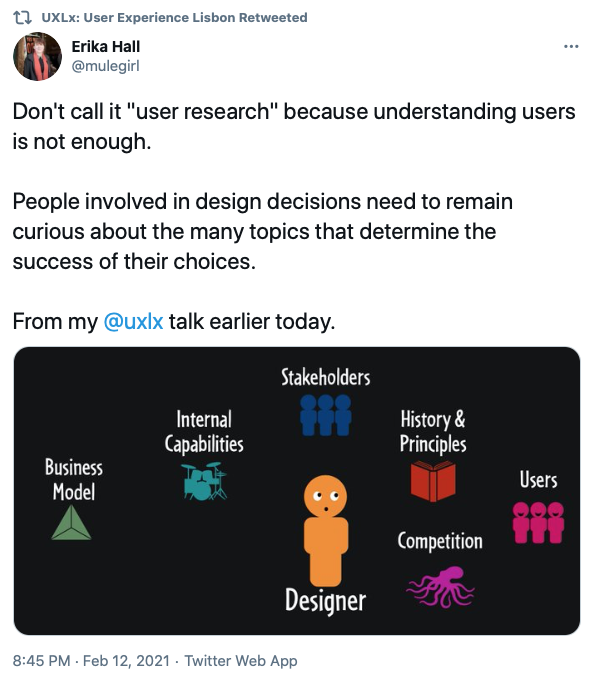
Erika advocates that we should start calling it design research and not user research because understanding users is just one part of it. Good research should also take into account stakeholders, internal capabilities, business model, history & principles and competition.
Research can be done is 3 main steps:
- Form questions
- Gather data
- Analise data
These steps don’t have to take much time. They can be done in a day or a year, depending on what you need to learn.
Research doesn’t tell you what to do. It just informs your process.
Then Erika talked about research activities and as they are simply ways to answer questions. There is no one best activity or method. The best activity is the one that helps you achieve your goal. Good research questions are specific, actionable and practical. However, research questions are not interview questions.
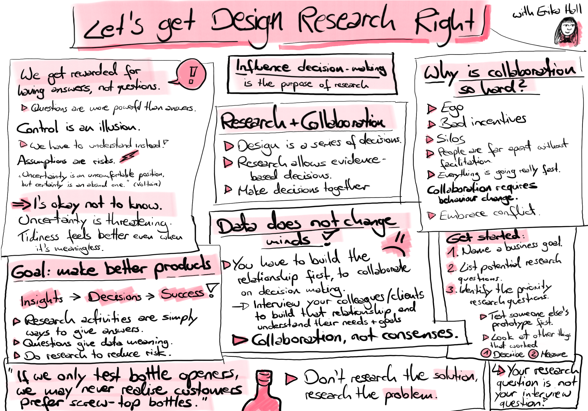
Masterclass sketchnote by Clara Gies
The Future of Feeling (after a Global Pandemic) by Pamela Pavliscak
Pamela talked about the emotional rollercoaster we’ve been living this past year. Emotions have been really intense: coronanxiety, boredom, newstalgia, anticipatory grief (anticipating the loss of things that were going to happen).
A year has passed and we’ve settled in to a sense of ennui, social anxiety, grief. We are living in an age mediated by technology.
She guided us through a series of new technology that is somehow connected with emotions (Vital Signs AI, Symptom Sense, Project Oxford, Rekognition).
“Emotion tech could nudge us toward emotionally intelligent design.”
She then talked about how we might shift towards design felling. She went through a series of pandemic-related emotions or conditions and looked at how we responded to that, some experiments:
- Pandemic stress: mood managers (meditation apps, slepp apps, etc.);
- Zoom gloom: caring communication (hard to communicate over zoom);
- Oxytocin deprivation (touch deprived): virtual touch;
- Socially distant: serendipity.
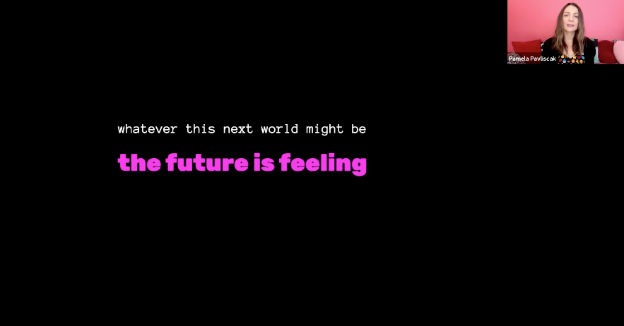
“We don’t know what this next world is gonna be but I think it’s almost certain that the emotional well-being of the people using the technology that we make, the technology that we put out in the world is going to be more and more important.”
Its’a an exciting new challenge to let people live more hopeful, full-filling, meaningful lives with technology.

What an amazing 3 days of new learnings and ideas! Having the chance to learn from the lifelong knowledge and experience of such world-renowned experts in the same event is not something we see very often. In some great networking moments we were able to share new ideas with peers from all over the world.
Although the online setting comes with it’s challenges (loading times, internet access difficulties, less engagement with people) this was certainly an amazing learning experience. We only hope we can all get together in-person again in sunny Lisbon really soon! 🤗☀️


A big shoutout 🙌
- To our brilliant speakers that had the challenge of sharing they knowledge and experience in an online setting.
- To the team that put together UXLx Masters.
- To our sponsors and supporters, specially to our main sponsor Outsystems.
- To our media partners: UXPodcast and Voice of Design.
- To two of our attendees, Mayra Bautista and Clara Gies, that from day 1 took the job of “unofficial UXLx Masters sketch noters”.
- To some of our attendees who were kind enough to share a bit about their experience and the main takeaways from the masterclasses their attended. We definitely recommend a close read:
“UXLx Masters 2021: Reflection on my learnings” by Josh Morales
“UXLx Masters 2021-My intakes on Day 1: Ux Strategy and Usability Testing” (see also day 2 and 3) by Rita Gomes da Silva
- To everyone who joined us during these 3 awesome learning days.
Related Articles
-
Looking to be EAA compliant? — Don’t fall for easy web accessibility solutions
Choosing an overlay is just a band-aid solution, and shows a true disregard for users with disabilities. Instead, we need to work towards a mentality where websites, apps and other digital products are designed and coded with accessibility in mind from day 1.
-
Prompt-based — The birth of a new human-machine interaction model
The ways humans interact with technology has evolved significantly over the decades — and it’s still constantly evolving. The rise of Artificial Intelligence (AI) and natural language processing (NPL) has brought to light a new way of interaction — prompts.
-
A glimpse into the future — Here’s the UX design trends we expect to dominate 2024
Emerging technologies and tools constantly influence the way people use the Internet and interact with digital products. And as user behaviours and preferences evolve, designers must keep up with new tools and solutions to deliver interfaces and user experiences that cater the needs of an ever-demanding audience.
-
How can insurance companies make their digital products more accessible?
Millions of people who live with a disability struggle to access important information online because websites and apps are built with major content and technological barriers. And insurance websites are not an exception.
-
Barrier-free banking - From branches to mobile apps accessible for all
In the banking and financial industry, accessibility is about empowering everyone, including people with disabilities and the elderly, to enjoy bank's products, services and facilities, by making them convenient and easy to use.
-
Design for a better world - How working together and applying design approaches is improving people's lives
9 November is World Usability Day 2023. This year's theme is Collaboration and Cooperation, which intents to focus on how we can work together to create solutions, both globally and locally, to solve the world's biggest problems.
-
Be an Agent of Change - Check these resources to help you build more ethical designs
The role of today's designer goes far beyond simply creating beautiful interfaces and experiences. You can no longer design without considering the consequences of how what you're creating impacts individuals, society and the world.
-
E-commerce and Accessibility - Creating an inclusive online shopping experience
Now it’s the time for online stores to improve their website accessibility and ensure they offer an inclusive experience for everyone.
-
The future is today — How can we leverage AI to improve our UX Design work
AI has now become a big part of several areas of our lives, and UX Design is no exception. It’s actually becoming more and more applicable to the UX design process.
-
Accessibility Compliance App - by Xperienz. A useful tool when fixing accessibility errors
To simplify the presentation of the accessibility evaluation of websites, Xperienz has created the Accessibility Compliance App. We start by doing a content inventory in which we collect all the pages of the site. Then we evaluate each page and list all the aspects that need to be fixed.
-
What does the UX future hold? - Here's the UX Design trends we expect to dominate 2023
Businesses must stay up to date on emerging user experience and interface trends so we've selected 7 top trends that are already making, and will certainly continue to make, an impact on website and app development.
-
Raising Awareness for Web Accessibility [Infographic] — International Day of Persons with Disabilities
Last December 3 we celebrated the International Day of Persons with Disabilities. To help promote a more accessible Web we’ve put together an easy-to-digest infographic about Web Accessibility.
-
Why hiring external UX services even when you have an in-house UX team?
Even if you have an in-house UX design team, there might be times when additional resources and professional know-how can be useful. Bringing in an external UX team might be exactly what you need for your company to excel in all projects.
-
Health and UX: when design has a life-saving potential
A good experience with healthcare technology and services, that is both useful, accessible and reliable, can make a huge different in improving peoples’ well-being, as well as the work of healthcare professionals.
-
Trust — Breaking or Building it Through Design
Trust is more valuable now than ever. 68% say trusting a brand they buy or use is more important today than in the past (Edelman, 2019). We live in an ever-growing digitalised world, where we increasingly interact and transact online. At the same time we constantly crave for trust-based interactions in digital environments. Questions like "Will the personal data I provide here be misused?", " Will my email be used to spam me incessantly?" or "Do I really want to share my bank details to a website I've never heard about?" have certainly come to our mind more than once.
-
Creating accessible digital experiences
Accessibility is of major importance for organisations who deliver web products and tools. Accessibility issues can affect not only a website’s usability for people who have disabilities but also for those who don’t. By offering accessible products, organisations will show they are inclusive, reach a wider market, be legally compliant, and offer a better user experience. For everyone.
-
"You're on Mute" - Lessons Learned After a Year of Conducting Remote User Research
After more than one year of engaging with users remotely, we want to reflect on the pitfalls of remote user research, share some of the lessons we learned and reflect on what’s going to be “the next normal” after Covid’s impact.
-
Quick & Dirty User Research
Tight timescales and budgets are no excuses to ditch user research altogether, specially when we all know it’s essential to make sure you deliver easy-to-use products. Quick and dirty research is a great way to get user insights fast and on a budget.
-
How bad metrics are hurting your business and your users’ experience
Businesses are deceiving themselves and annoying their customers as a consequence. They do so when they apply biased surveys only expecting to confirm what they want to hear.
-
UX Writing — Create better experiences with better content
Imagine a website or an app with no words. If it wasn’t for the logo, would you be able tell what this page is about? Would you know which button to click? Where navigation would take you? What you’re supposed to write in the search bar? No matter how good-looking an interface is, without words users will simply not be able to accomplish any tasks in it.
-
10 Bad User Research Practices You Will Want to Avoid
Some might think user research is as simple as watching people perform a few tasks on a website or asking them a few questions, but user research is definitely not walk in the park. Let’s go through some of the mistakes that can arise when planning and conducting research.
-
Responsive Illustrations
Can the same illustration be used the same way on a desktop screen, on a tablet or on a smartphone? How is it possible to make them look great on every screen without losing quality or the idea the brand is trying to convey?
-
UXLx Masters — Wrap-up
From 10 to 13 February attendees from 25 countries and 14 world-renowned UX experts joined online for 3 days of learning. The programme included 12 live masterclasses, 2 keynotes, 2 live podcasts, and more.
-
The Design Role in Digital Transformation
As the world keeps evolving and digital becomes more crucial to our everyday life, companies are feeling pressured to keep up and level up their game.
-
Remote UX Research — our selection of the best online tools to conduct it
As a company that focus on UX research and design, we gathered some of the best tools to conduct remote research and combined them, with our personal knowledge, in this article.
-
Why We Need Parametric UI Design Tools
In Design, parametric refers to a process based on algorithmic thinking that uses parameters and their interrelations to define a geometric form (which can be buttons, containers, panels, etc.).


