Creating accessible digital experiences
August 26, 2021
No, we didn’t accidentally added a blurred image to this article. This is an example of what our website might look like for someone with low vision.
The World Health Organisation estimates that about 285 million people are visually impaired worldwide. 39 million are blind and 246 million have low vision. If a visually impaired person decides to visit our website, or any other website out there, they should be able to perceive, understand, navigate and interact with it. They have the right to it, just like someone who sees everything clearly.
For people with visual impairments or any other type of disability —hearing loss, learning difficulties, muteness, limited fine motor control, etc. — to be able to access websites and web tools with no major issues, they need to be designed and coded properly. The problem is that’s not always the case. Many websites and tools are built with accessibility barriers that make it very hard or even impossible for some people to use.
Accessibility is of major importance for organisations who deliver web products and tools. Accessibility issues can affect not only a website’s usability for people who have disabilities but also for those who don’t. By offering accessible products, organisations will show they are inclusive, reach a wider market, be legally compliant, and offer a better user experience. For everyone.
What is web accessibility?
Web accessibility is about creating websites, apps and web tools that can be used by everyone regardless of their ability. It’s about allowing everyone, including people with disabilities, to perceive, understand, navigate and interact with the internet.
Accessibility improves the usability for everyone — Although accessibility focuses, in a first stage, on users with disabilities, it can actually improve the experience for everyone. Imagine you’re in a loud environment and unable to hear audio, having the option to turn on subtitles on the video you’re watching will allow you to understand what is being said. Maybe you’re outside in bright sunlight and can’t see a screen. If the website has sufficient contrast you’ll have higher changes of seeing the information displayed.
Disabilities and web accessibility barriers
According to the World Health Organisation’s 2011 world report on disabilities, 1 billion of the world’s population live with a disability.
Even if you’re not part of that billion, you can eventually experience a temporary impairment due an accident, surgery or medication.
Types of disabilities
There are many reasons why people may be experiencing a certain degree of disability — it can be from birth, illness, disease, accident or they might develop impairments with age.
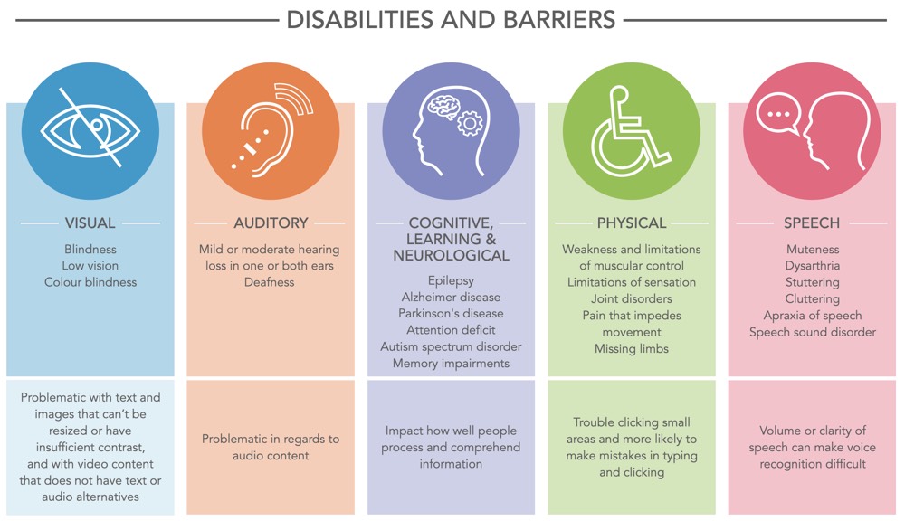
We can distinguish five types of disabilities that can impact how people use the web:
- Visual — Blindness, low vision, colour blindness, increased sensitivity to bright colours. People with visual disabilities have problems accessing information when text, images and page layouts can’t be resized, when video content doesn’t have text or audio alternatives, or when text and images have insufficient contrast between foreground and background color combinations;
- Auditory — Mild or moderate hearing loss in one or both ears and deafness. People with auditory disabilities have problems regarding audio content, so it needs to have alternatives, such as transcripts or captions.
- Cognitive, Learning and Neurological — Neurological disorders, as well as behavioural and mental health disorders (i.e. epilepsy, Alzheimer’s, multiple sclerosis, Parkinson’s disease, Autism spectrum disorder, dyslexia, dysgraphia, attention deficit, memory impairments). They affect how well people process and comprehend information.
- Physical — Weakness and limitations of muscular control, limitations of sensation, joint disorders, pain that impedes movement, and missing limbs. People with physical disabilities might experience trouble clicking small areas and are more likely to make mistakes when typing and clicking. They often use specialised hardware and software, like ergonomic or specially designed keyboard or mouse, head pointer, mouth stick, etc.
- Speech — Muteness, impairment and/or difficulty in being understood (i.e. stuttering, dysarthria, cluttering, apraxia of speech, speech sound disorder). People with speech disabilities encounter barriers with voice-based services as their volume or clarity of speech can make voice recognition difficult.
Source: https://www.w3.org/WAI/people-use-web/abilities-barriers/
Going beyond web accessibility
People with disabilities not only use their computers to access content, they also use mobile phones, tablets and other devices— smart TVs, wearables (smart watches), devices in car dashboards and airplane seatbacks, devices in household appliances and smart home technology.
All these devices mean a new range of accessibility issues to address— touchscreens, small screen sizes, different input modalities (speech, for example), usage in different settings (such as in bright sunlight).
By developing a mobile application with accessibility in mind, brands are enabling people with disabilities to access the mobile world. They also broaden the brand’s scope and make sure they reach the widest possible audience.
A few ways to build accessible apps

- Design for varying screen sizes — smaller screens limit the amount of information people can see at a time, particularly when users with visual impairments need to zoom in content.
- Tap targets must be big enough for people to interact with precision. Smaller touch targets must be surrounded by inactive space to avoid unintended actions.
- Buttons should be placed where they are easy to access.
- Device gestures should be kept simple so they are easy to execute (one-finger tap, for example). More complex gestures, involving multiple fingers or drawing shapes, will be more challenging for people with motor or dexterity impairments.
- If users take unintentional actions like clicking something by accident, they should be able to easily go back and fix the mistake.
- Offer the options to adjust text size, brightness and colour within the app settings.
- Data entry using on-screen keyboard, a bluetooth keyboard or speech, might be difficult for some users. The ideal is to reduce the amount of data entry required by providing select menus, radio buttons or check boxes. Giving alternatives like autofilling known information, data sharing between apps or dictation will prevent errors and improve the experience.
- Make sure the app plays nicely with built-in accessibility tools (Android’s Google Voice Assistant and VoiceOver from iOS, for example).
Why should organisations care about creating accessible products and services?
Accessibility is of major importance for organisations who want to create high-quality digital experiences, and not exclude people from using their product or service.
Key benefits:
- Maximising target audience: If we think that 15% of the world’s population has some sort of disability, that’s actually millions of people who have millions in purchasing power. It becomes clear that making organisations’ websites accessible has businesses benefits.
- Possibly stand out from the competition: If people with disabilities can’t use an organisation’s website they’ll easily turn to a competitor who offers a similar product or service.
- Avoiding discrimination: By creating accessible, high-quality websites and tools, organisations aren’t excluding people from using their products and services.
- Legal compliance: In many countries having an accessible website is required by law.
- EU member states used to have their own laws regarding accessibility so the EU established the European Accessibility Act, that aims to improve the functioning of the internal market for accessible products and services, by removing barriers created by divergent rules in member states. To complement it, the EU applied the Web Accessibility Directive. It provides people with disabilities with better access to websites and mobile apps of public services. EU countries have until 2022 to apply this directive, incorporating it into their national legislation.
- Section 508 of the Rehabilitation Act of 1973 requires federal agencies in the United States to ensure that their electronic and information technology is accessible.
- In the UK, the Equality Act 2010 states that goods and services providers (from both public and private sectors) have a legal obligation not to discriminate against people based on the number of protected characteristics, including disability. If a business’ website is not accessible, the organisation can be sued for discrimination.
- Creating a positive public impression: Organisations will prove their commitment to break barriers and create a web that’s accessible to everyone.
- Saving time and money when accessibility is considered right from the beginning: Building accessible products right from day one will make it possible to identify possible issues and correct them when they are still easy to fix. It will avoid a major redesign after the product is launched.
- Boosting SEO: Search engines rely on content structure, semantics and functionality to present content to users and determine its relevance. Accessible websites can then have better search results.
- Improving usability and user satisfaction: Accessible websites will provide a better experience to users both with and without disabilities, and ultimately increase their satisfaction. Satisfied users that will most likely keep visiting the website, purchasing and recommend it to their friends.
How can we evaluate accessibility?
When you’re developing or redesigning a website, it’s best to evaluate accessibility from the start and include it throughout the development process so any accessibility issues are identified early, when it’s easier to address them.
Standards Review
To assess accessibility issues and improve web accessibility, the World Wide Web Consortium (W3C) defined a set of guidelines — the Web Content Accessibility Guidelines (WCAG). The guidelines and success criteria are organised under 4 principles:
- Perceivable: Information can’t be invisible to users’ senses (sight, sound and touch). Users must be able to perceive all information presented.
- Operable: Users must be able to operate the interface. For example, ensuring a good keyboard-only navigation will make it easier for people with motor difficulties to browse the web.
- Understandable: Users must be able to understand the content and operation of the interface. The terms have to be clear, instructions simple and complex issues explained.
- Robust: Content must be interpreted reliably by a wide variety of user agents, including assistive technologies, like screen readers.
These guidelines are organised into three levels of conformance. They all have criteria that must be met to consider a website is accessible for all users, covering aspects like site navigation, text, videos, inputs and more.
- Level A: The most basic web accessibility requirements. Websites that don’t meet this level are impossible or very difficult for people with disabilities to use.
- Level AA: Requirements include the biggest and most common barriers for disabled users. If a website meets this level then it is usable and understandable for most people with or without disabilities. It’s the most used level around the world when it comes to accessibility rules and regulations.
- Level AAA: The highest and most complex level of accessibility. If a website hits this level then it means it is accessible to the maximum number of users and the navigation experience is easy.
The WCAG guidelines are universally accepted and adopted. In some countries and jurisdictions there are legal reasons for implementing them. European Union requires that websites and mobile apps of public sector conform with level AA.
Accessibility Evaluation Tools
Software tools can identify accessibility issues and increase efficiency of evaluation by saving time and effort. However, alone they cannot determine if a product meets standards and is accessible.
Heuristic Evaluation
Finding the usability problems in a user interface according to an established list of rules called heuristics, so that they can be attended to as part of an iterative design process.
Design Walkthroughs
Find potential usability and accessibility issues by visualising the user’s route through an early concept or prototype. A walkthrough can be performed using personas with disabilities and scenarios that include adaptive strategies to complete tasks.
Screening Techniques
Activities to help identify potential accessibility barriers in product designs. It involves interacting with a product with one or more physical or sensory abilities eliminated or modified.
Usability Testing
Evaluating some aspects of accessibility by using standard usability testing protocols, with a few modifications to include participants with disabilities and use assistive technology (i.e. hearing aids, screen readers, voice recognition programs) and whichever input or output peripherals (i.e. keyboard, mouse, monitor, headphones) people use on their day-to-day.
Best practices for accessible websites
1. Provide sufficient contrast and don’t rely on colour to communicate information
People with visual impairments may find it difficult to read text without enough contrast against the background. Text and images of text should have a contrast ratio of at least 4.5:1. (WCAG 1.4.3 Contrast).
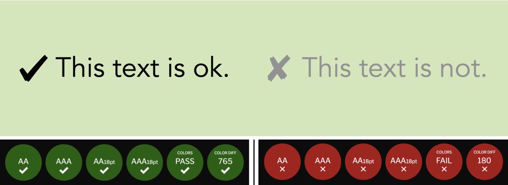
When using a contrast checker tool we can see that the text on the left passes and the one on the right fails
Still regarding colour, it can’t be used as the only visual means of conveying information. Design that relies solely on colour limits engagement for colourblind users who are unable to distinguish colour differences.
2. Provide alternative text for non-text content
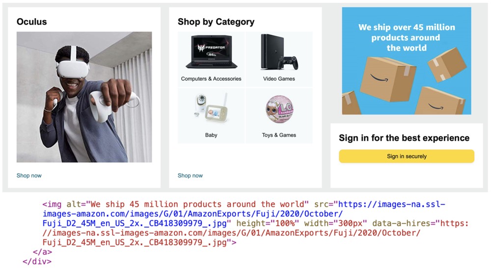
Alt text example from Amazon
As we see here, Amazon is using an image to inform people they ship over 45 millions products around the world. In the HTML markup, we can see that the image alt text states exactly the information the image conveys. This way people with visual disabilities using screen readers will hear text content in place of the image.
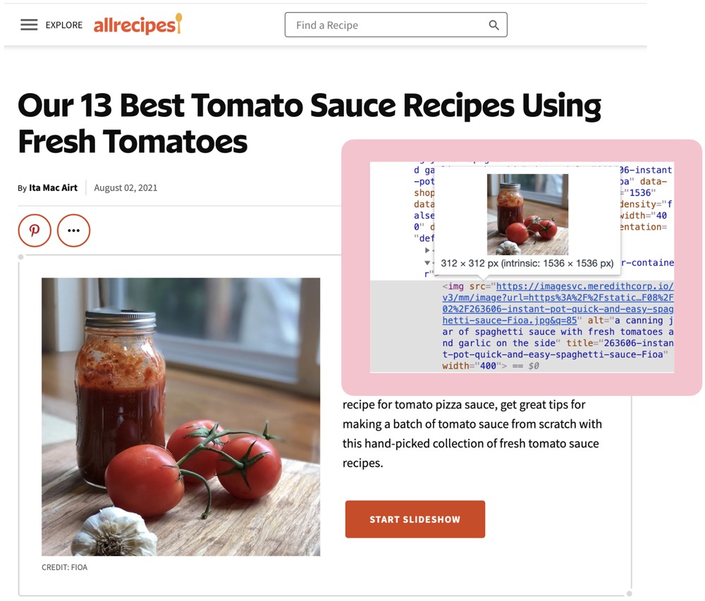
Alt text example from All Recipes
When a screen reader reads the image above it will say “image” and then the alternative (“alt”) text “a canning jar of spaghetti sauce with fresh tomatoes and garlic on the side”. If the image didn’t have any alt text, the screen-reader would simply skip it. Alt text will also appear if an image on a webpage fails to load on a user’s screen. Instead of seeing a broken link icon, they’ll see the alt text and know what the image was supposed to convey. It also gives search engines better information to rank a website with and possibly rank it higher.
3. Label forms correctly and provide feedback for errors
Screen readers can’t go through form fields if they aren’t labeled correctly. They might also miss label words inside the form field.
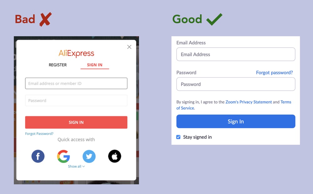
Label forms examples from AliExpress and Zoom
In AliExpress Sign In form both form fields have no label, only placeholder text. Not to mention the other accessibility problem here — placeholder text colour clearly doesn’t have the necessary contrast ratio.
In Zoom’s example we can see that form fields have both labels and placeholder text (although in this case it’s a bit redundant).
Since we’re on the forms subject we should also talk about feedback errors. It gets really frustrating when you supposedly made a mistake and don’t know why that happened. It should be easy for users to quickly correct their errors. Hints and instructions should be persistent and placed outside of the form field.
NN Group has an entire article about how placeholders in form fields are harmful. Worth checking!
4. Ensure keyboard accessibility
Someone with some kind of physical disability that stops them from using their mouse needs an alternative to navigate through a website, and that is often keyboard navigation.
Using the keyboard tab key and other keystrokes, users must quickly access and move between links, buttons, forms and other controls.
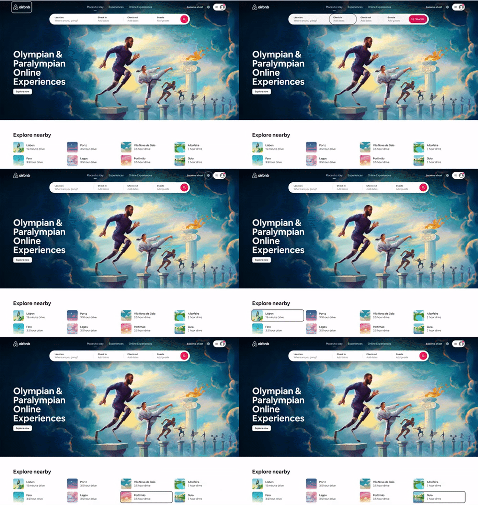
Using the tab key to navigate through Airbnb website
5. Make navigation consistent
A website’s navigation bar must be easy to use and fixed on top of all website’s pages. It should include a list of items with links to the main sections of the site. Users should be able to quickly locate the search function. The website should also include a “skip navigation” link as the first link on every page. This allows users to skip navigation and start interacting with the main content of a page.

“Skip to content” link in Airbnb website
6. Provide captions and transcripts for videos and podcasts
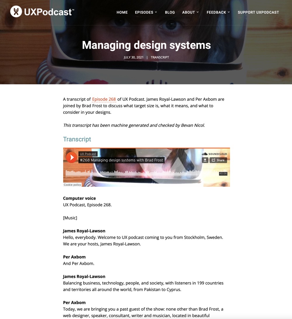
UX Podcast provides transcripts for their episodes
Videos on websites must provide an audio description so that blind people and others who can’t see videos adequately get the visual information need to understand the content. It can be things like charts, graphs and text (speaker names, titles, e-mail addresses).
Videos should also include captions so that deaf and hard-of-hearing people can get a text version of the speech and non-speech audio information they need to understand the content.
Podcasts, for example, should include transcripts. A text version of the speech and non-speech audio information that allows hearing disabled people to understand the content.
The internet has increasingly become a crucial resource in many aspects of our lives, be it education, government, health care, commerce, etc. It needs to be accessible so that everyone has equal access and opportunities, regardless of their abilities.
Accessible design will not only make it possible for people with disabilities to use a website or app, it will also improve the overall experience and satisfaction of all users.
Moreover, accessibility has its business benefits. It will enhance the brand, drive innovation and extend market reach.
Want to offer a service accessible to everyone?
Xperienz can help you assess if all users can navigate and complete the necessary tasks on your website, app or digital tool.
Whether confirming if it meets WCAG guidelines, performing a heuristic evaluation or running usability tests, we’ll ensure your organisation benefits from building an easy-to-use site for all users.
Tell me moreRelated Articles
-
Digital Accessibility Strategy Course [starts in January 2025]
The new Digital Accessibility Strategy course aims to equip participants with the essential skills to understand the digital accessibility landscape.
-
Looking to be EAA compliant? — Don’t fall for easy web accessibility solutions
Choosing an overlay is just a band-aid solution, and shows a true disregard for users with disabilities. Instead, we need to work towards a mentality where websites, apps and other digital products are designed and coded with accessibility in mind from day 1.
-
Prompt-based — The birth of a new human-machine interaction model
The ways humans interact with technology has evolved significantly over the decades — and it’s still constantly evolving. The rise of Artificial Intelligence (AI) and natural language processing (NPL) has brought to light a new way of interaction — prompts.
-
A glimpse into the future — Here’s the UX design trends we expect to dominate 2024
Emerging technologies and tools constantly influence the way people use the Internet and interact with digital products. And as user behaviours and preferences evolve, designers must keep up with new tools and solutions to deliver interfaces and user experiences that cater the needs of an ever-demanding audience.
-
How can insurance companies make their digital products more accessible?
Millions of people who live with a disability struggle to access important information online because websites and apps are built with major content and technological barriers. And insurance websites are not an exception.
-
Barrier-free banking - From branches to mobile apps accessible for all
In the banking and financial industry, accessibility is about empowering everyone, including people with disabilities and the elderly, to enjoy bank's products, services and facilities, by making them convenient and easy to use.
-
Design for a better world - How working together and applying design approaches is improving people's lives
9 November is World Usability Day 2023. This year's theme is Collaboration and Cooperation, which intents to focus on how we can work together to create solutions, both globally and locally, to solve the world's biggest problems.
-
Be an Agent of Change - Check these resources to help you build more ethical designs
The role of today's designer goes far beyond simply creating beautiful interfaces and experiences. You can no longer design without considering the consequences of how what you're creating impacts individuals, society and the world.
-
E-commerce and Accessibility - Creating an inclusive online shopping experience
Now it’s the time for online stores to improve their website accessibility and ensure they offer an inclusive experience for everyone.
-
The future is today — How can we leverage AI to improve our UX Design work
AI has now become a big part of several areas of our lives, and UX Design is no exception. It’s actually becoming more and more applicable to the UX design process.
-
Conducting usability testing with people with disabilities
Drawing on our experience conducting usability tests with users with disabilities, we’re sharing a few things to take into account when planning and conducting research with people with disabilities and make sure everything goes smoothly and you can collect valuable insights.
-
Accessibility Compliance App - by Xperienz. A useful tool when fixing accessibility errors
To simplify the presentation of the accessibility evaluation of websites, Xperienz has created the Accessibility Compliance App. We start by doing a content inventory in which we collect all the pages of the site. Then we evaluate each page and list all the aspects that need to be fixed.
-
What does the UX future hold? - Here's the UX Design trends we expect to dominate 2023
Businesses must stay up to date on emerging user experience and interface trends so we've selected 7 top trends that are already making, and will certainly continue to make, an impact on website and app development.
-
Raising Awareness for Web Accessibility [Infographic] — International Day of Persons with Disabilities
Last December 3 we celebrated the International Day of Persons with Disabilities. To help promote a more accessible Web we’ve put together an easy-to-digest infographic about Web Accessibility.
-
Why hiring external UX services even when you have an in-house UX team?
Even if you have an in-house UX design team, there might be times when additional resources and professional know-how can be useful. Bringing in an external UX team might be exactly what you need for your company to excel in all projects.
-
Health and UX: when design has a life-saving potential
A good experience with healthcare technology and services, that is both useful, accessible and reliable, can make a huge different in improving peoples’ well-being, as well as the work of healthcare professionals.
-
Trust — Breaking or Building it Through Design
Trust is more valuable now than ever. 68% say trusting a brand they buy or use is more important today than in the past (Edelman, 2019). We live in an ever-growing digitalised world, where we increasingly interact and transact online. At the same time we constantly crave for trust-based interactions in digital environments. Questions like "Will the personal data I provide here be misused?", " Will my email be used to spam me incessantly?" or "Do I really want to share my bank details to a website I've never heard about?" have certainly come to our mind more than once.
-
Creating accessible digital experiences
Accessibility is of major importance for organisations who deliver web products and tools. Accessibility issues can affect not only a website’s usability for people who have disabilities but also for those who don’t. By offering accessible products, organisations will show they are inclusive, reach a wider market, be legally compliant, and offer a better user experience. For everyone.
-
"You're on Mute" - Lessons Learned After a Year of Conducting Remote User Research
After more than one year of engaging with users remotely, we want to reflect on the pitfalls of remote user research, share some of the lessons we learned and reflect on what’s going to be “the next normal” after Covid’s impact.
-
Quick & Dirty User Research
Tight timescales and budgets are no excuses to ditch user research altogether, specially when we all know it’s essential to make sure you deliver easy-to-use products. Quick and dirty research is a great way to get user insights fast and on a budget.
-
How bad metrics are hurting your business and your users’ experience
Businesses are deceiving themselves and annoying their customers as a consequence. They do so when they apply biased surveys only expecting to confirm what they want to hear.
-
UX Writing — Create better experiences with better content
Imagine a website or an app with no words. If it wasn’t for the logo, would you be able tell what this page is about? Would you know which button to click? Where navigation would take you? What you’re supposed to write in the search bar? No matter how good-looking an interface is, without words users will simply not be able to accomplish any tasks in it.
-
10 Bad User Research Practices You Will Want to Avoid
Some might think user research is as simple as watching people perform a few tasks on a website or asking them a few questions, but user research is definitely not walk in the park. Let’s go through some of the mistakes that can arise when planning and conducting research.
-
Responsive Illustrations
Can the same illustration be used the same way on a desktop screen, on a tablet or on a smartphone? How is it possible to make them look great on every screen without losing quality or the idea the brand is trying to convey?
-
UXLx Masters — Wrap-up
From 10 to 13 February attendees from 25 countries and 14 world-renowned UX experts joined online for 3 days of learning. The programme included 12 live masterclasses, 2 keynotes, 2 live podcasts, and more.
-
The Design Role in Digital Transformation
As the world keeps evolving and digital becomes more crucial to our everyday life, companies are feeling pressured to keep up and level up their game.
-
Remote UX Research — our selection of the best online tools to conduct it
As a company that focus on UX research and design, we gathered some of the best tools to conduct remote research and combined them, with our personal knowledge, in this article.
-
Why We Need Parametric UI Design Tools
In Design, parametric refers to a process based on algorithmic thinking that uses parameters and their interrelations to define a geometric form (which can be buttons, containers, panels, etc.).


